UX/UI Design
How to Design Better Buttons
Buttons are the most used component in any product and the easiest to get wrong. This guide covers anatomy, hierarchy, states, sizes, icon buttons and how to set them up in Figma.
Muhammad Saud Musaddiq4 min read
Anatomy
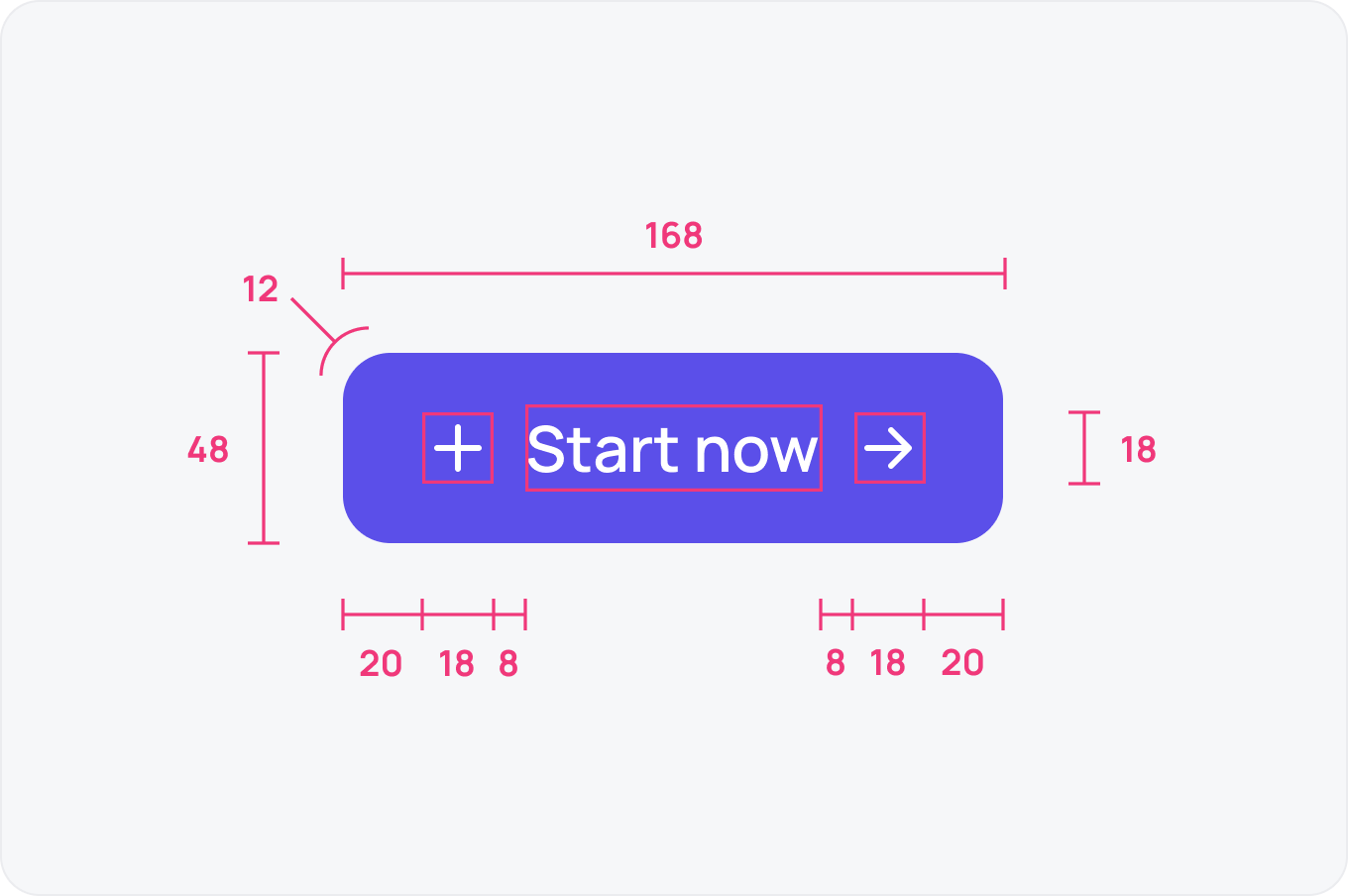
A button is a label, optional leading and trailing icons, horizontal padding and a corner radius on a fixed height. Lock those values once and every button in the product stays consistent.
Hierarchy
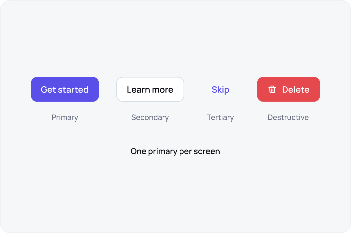
Primary is the one action you want taken, secondary supports it, tertiary is for low commitment actions and destructive warns before damage. Keep one primary per screen so the eye knows where to go.
States
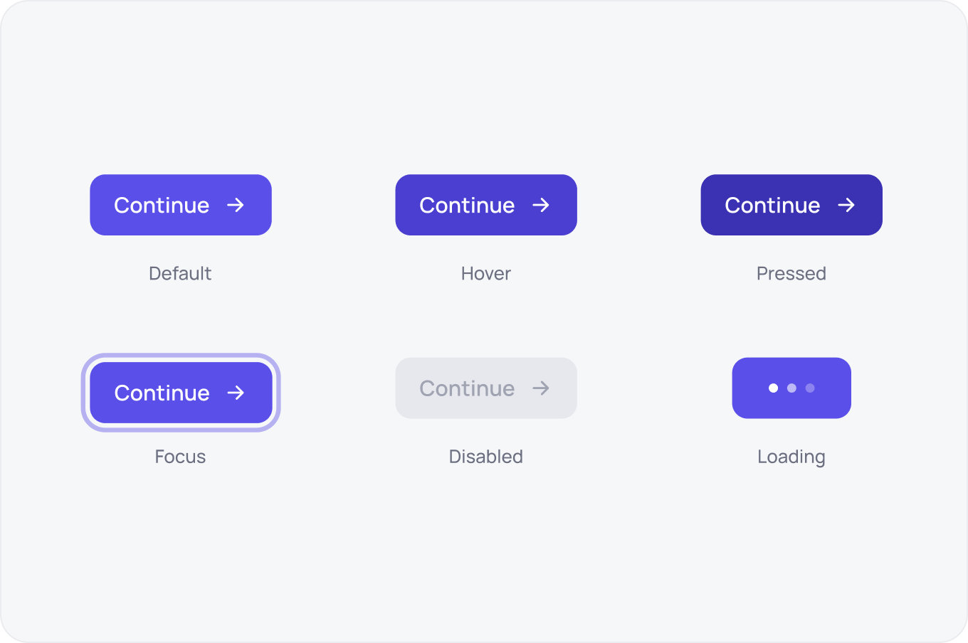
Every button needs default, hover, pressed, focus, disabled and loading. Focus is the one most teams skip, and it is the one keyboard users depend on.
Sizes
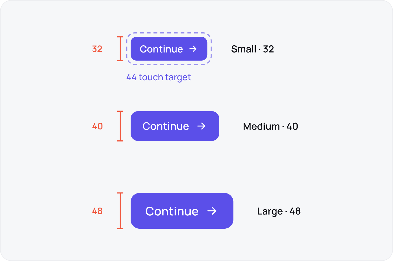
Three sizes cover almost everything: 32 for dense tables, 40 as the default and 48 for hero actions. On touch screens keep the hit area at 44 even when the visual is smaller.
Icon Buttons
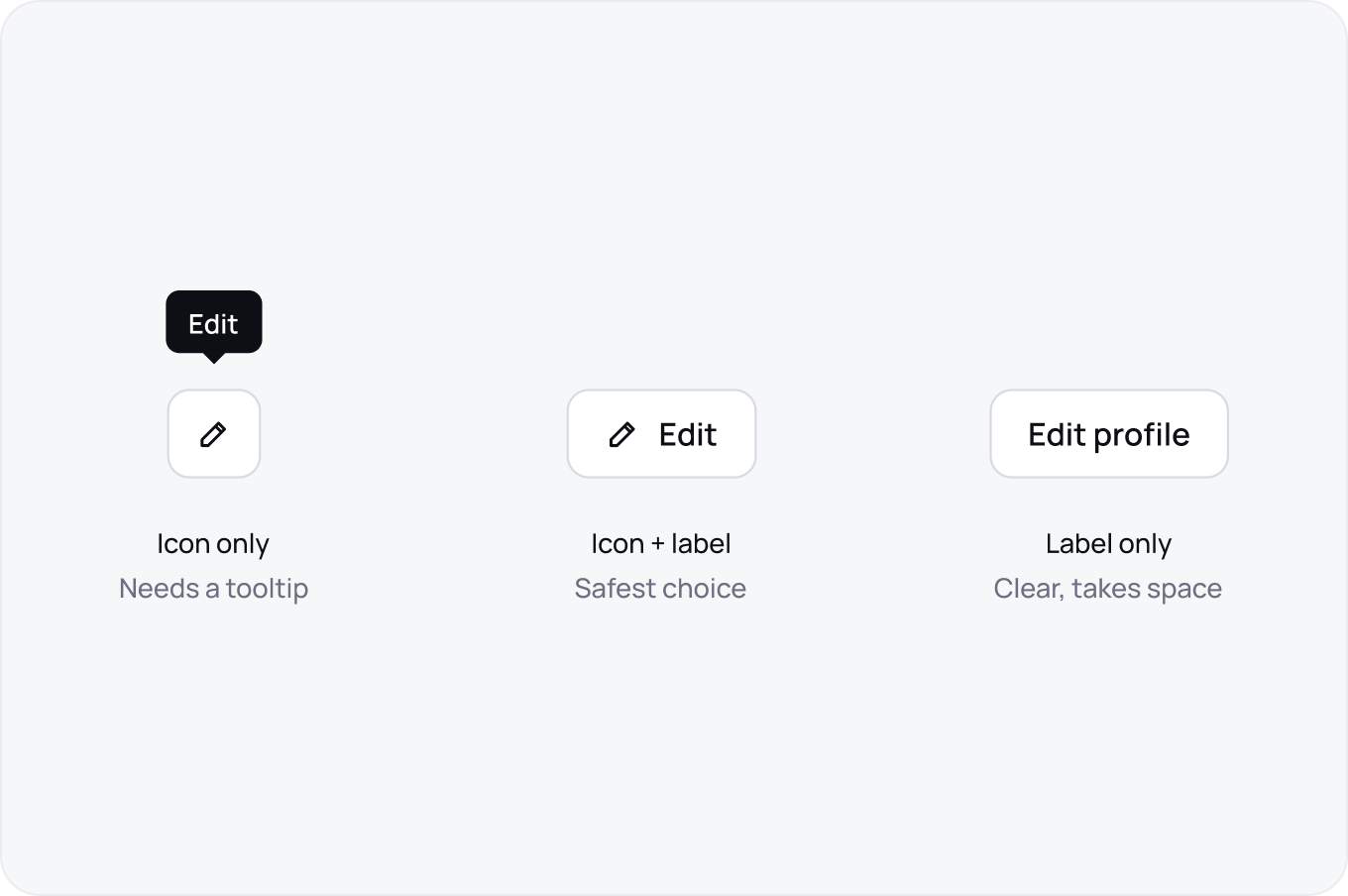
Icon only buttons save space but lose meaning, so pair them with a tooltip or a visible label wherever the action is not obvious. When in doubt, use icon plus label.
Properties in Figma
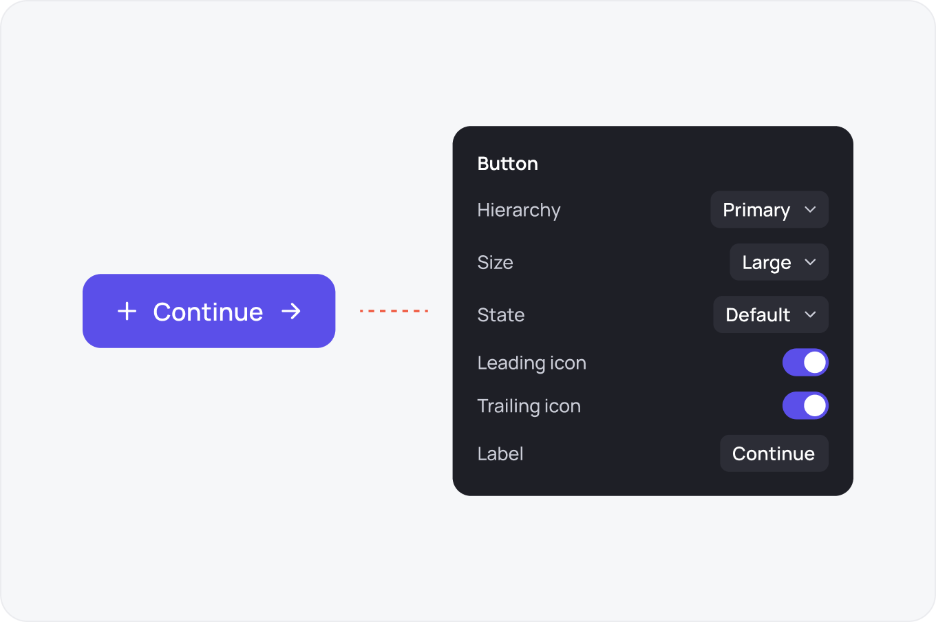
Build one component set with variants for hierarchy, size and state, plus booleans for leading and trailing icons and a text property for the label. That is four controls instead of forty components.
Styles Worth Using
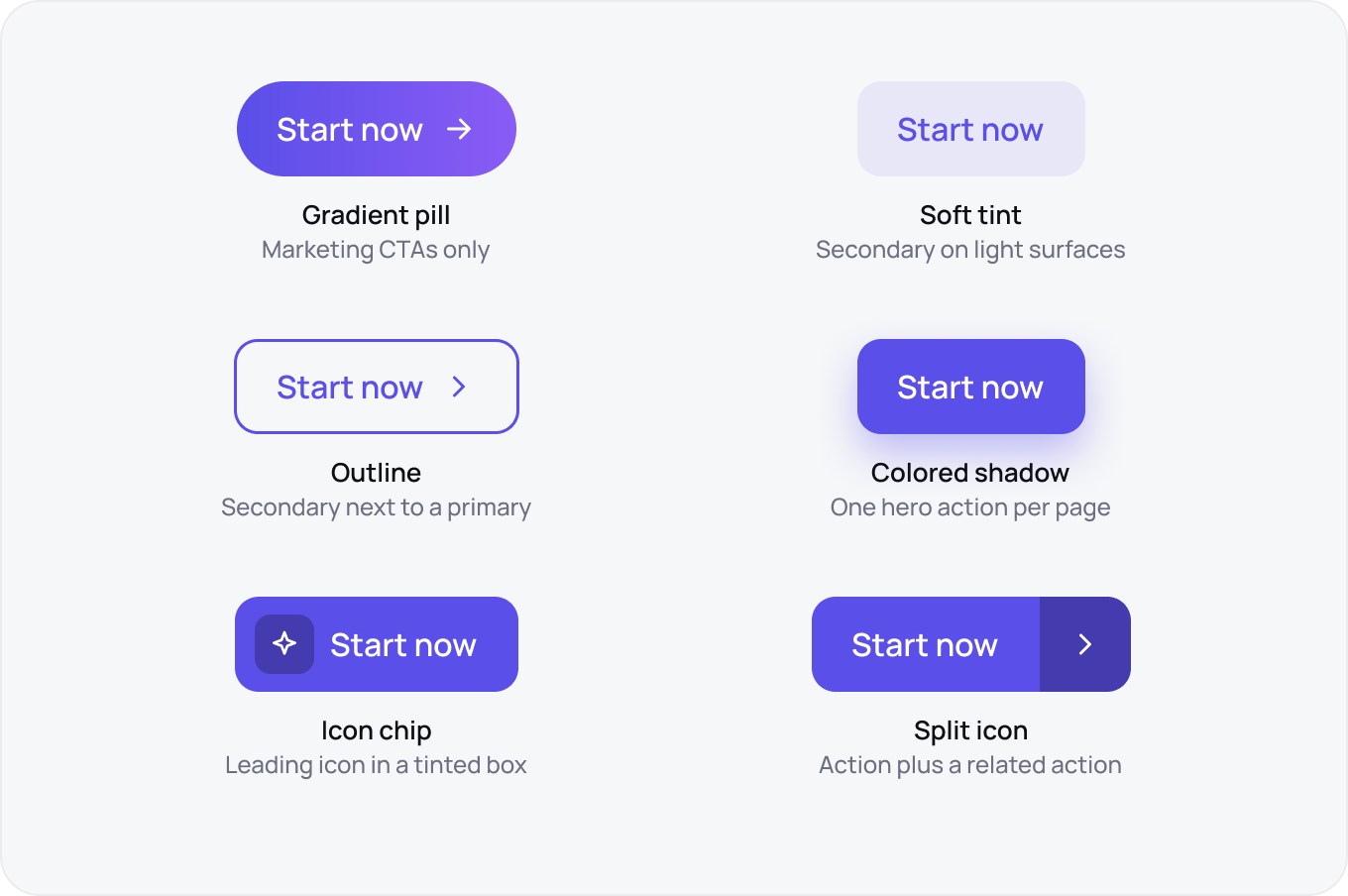
Most button styles are decoration. These six earn their place because each one solves a real hierarchy problem. Skip offset shadows, glitch borders, gradients that fade to white and emojis used as icons.