Figma · Auto Layout
How to Build a Responsive Web Card with Auto Layout
Auto Layout lets you build cards that resize and reflow on their own. This post walks through a responsive web card in Figma using wrap, min width and max width. The same rules work for any component.
Muhammad Saud Musaddiq4 min read
Design content for the card
Create two frames: one for the image, one for the title, description and buttons. That split gives the card a clear hierarchy from the start.
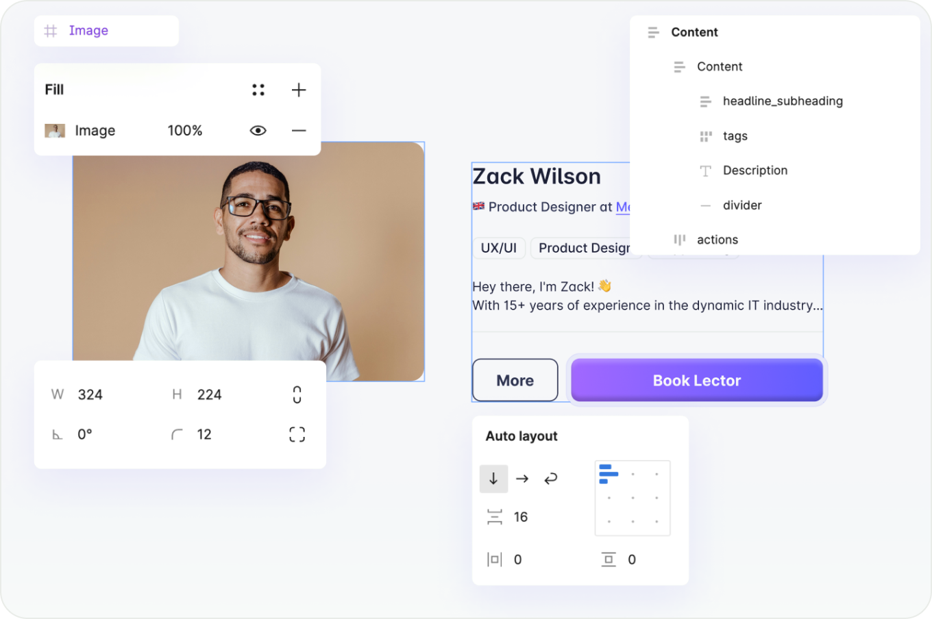
Merge Content
Select both frames and press Shift + A to wrap them in an Auto Layout frame. Keep padding and spacing on multiples of 4 or 8 for a clean grid.
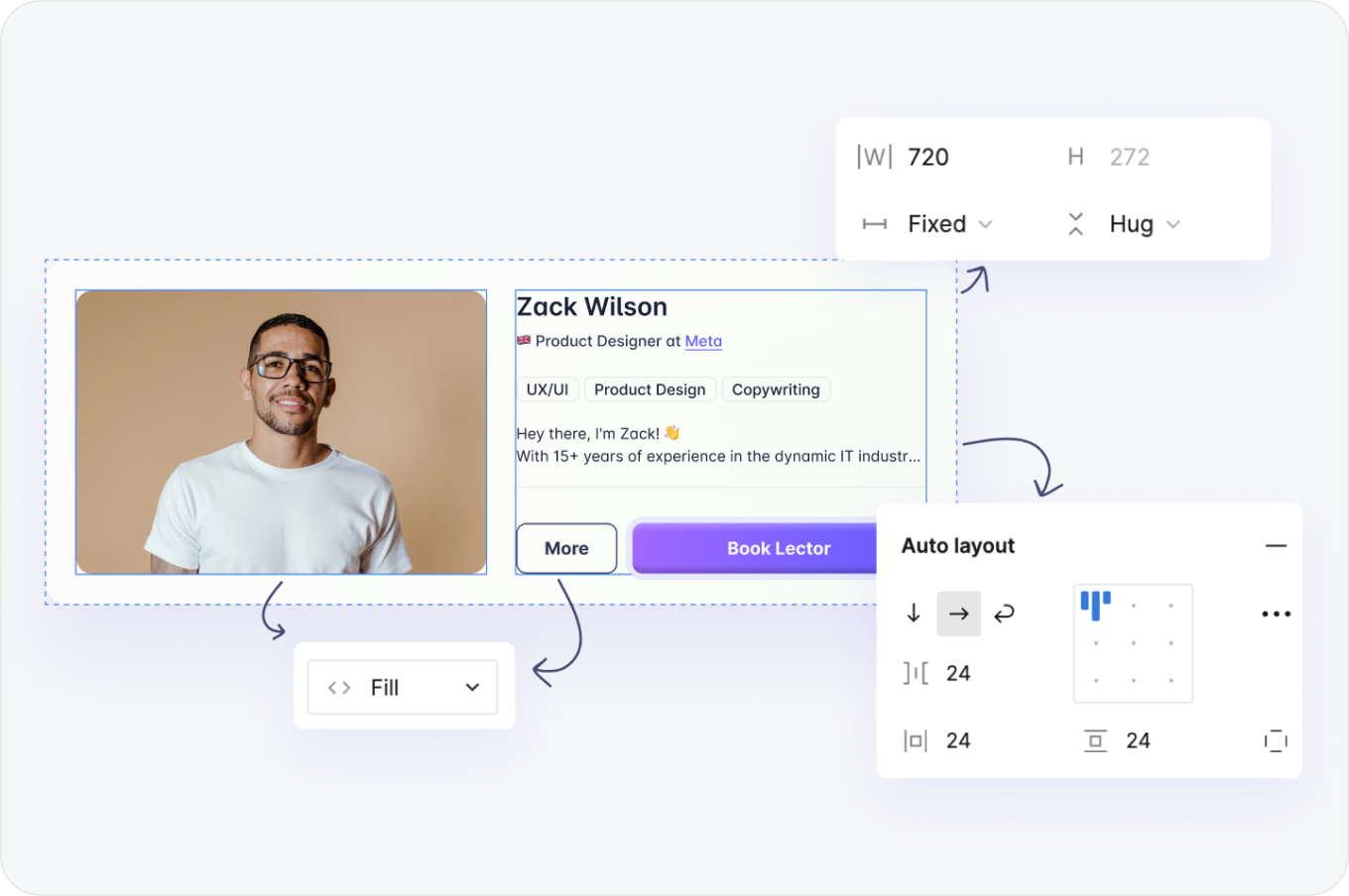
Wrap Features
Select the card frame and set its layout to Wrap. Content moves to a new line when the width runs out, so nothing overflows or gets cut off.
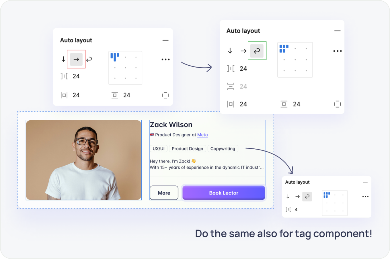
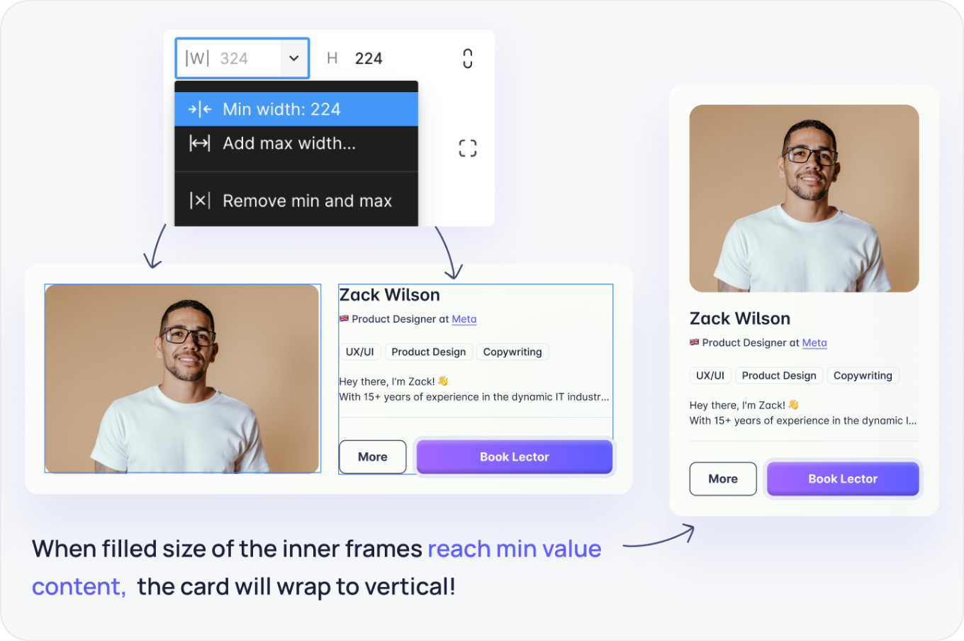
Min Value for Content
Set a minimum width on both inner frames, for example 224 px. The content never collapses below that, even on small screens.
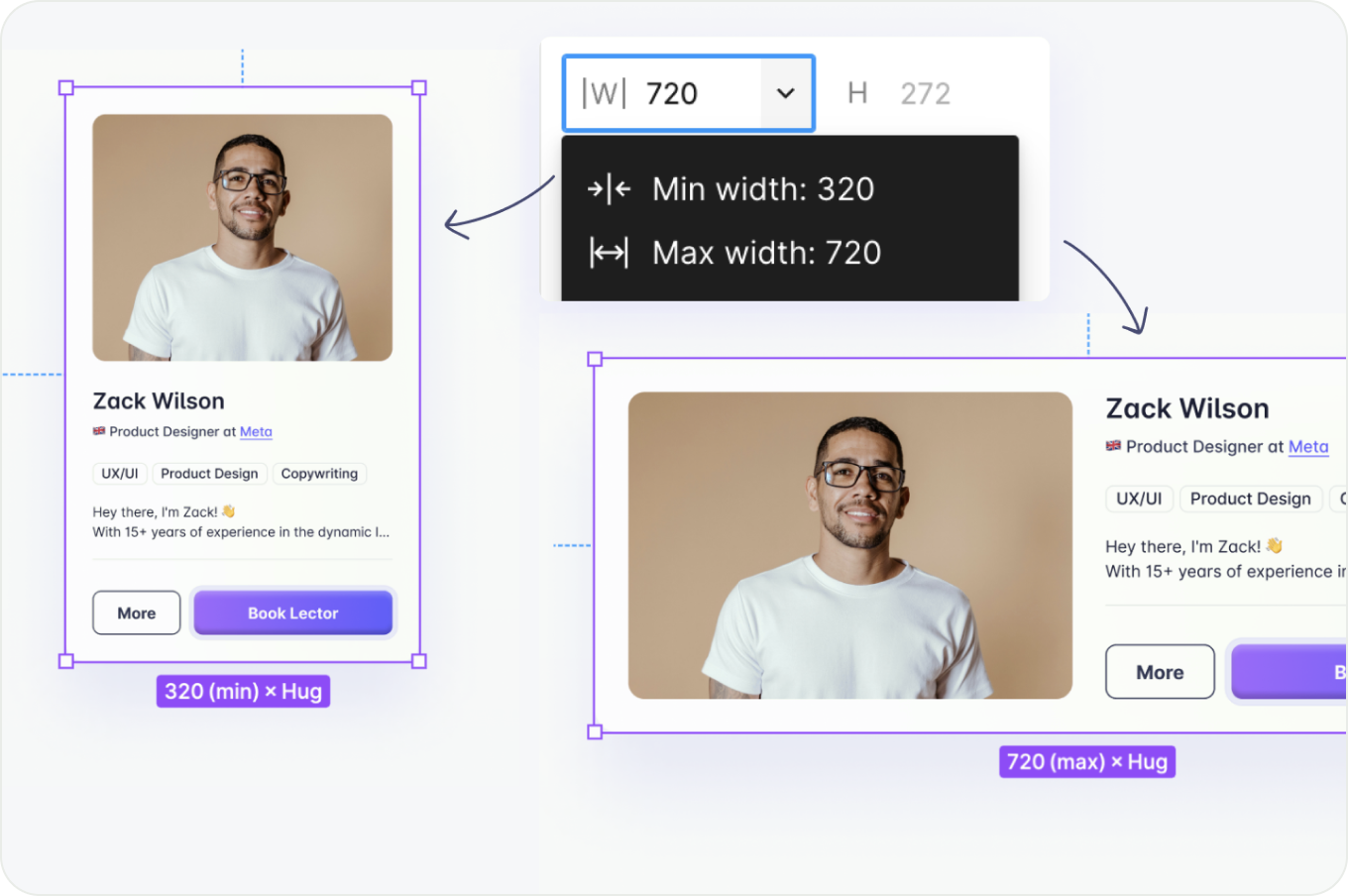
Min/Max Card
Set a minimum and maximum width on the card frame. This keeps it from getting too narrow or too wide and makes it easy for developers to implement.
Spacing Measures
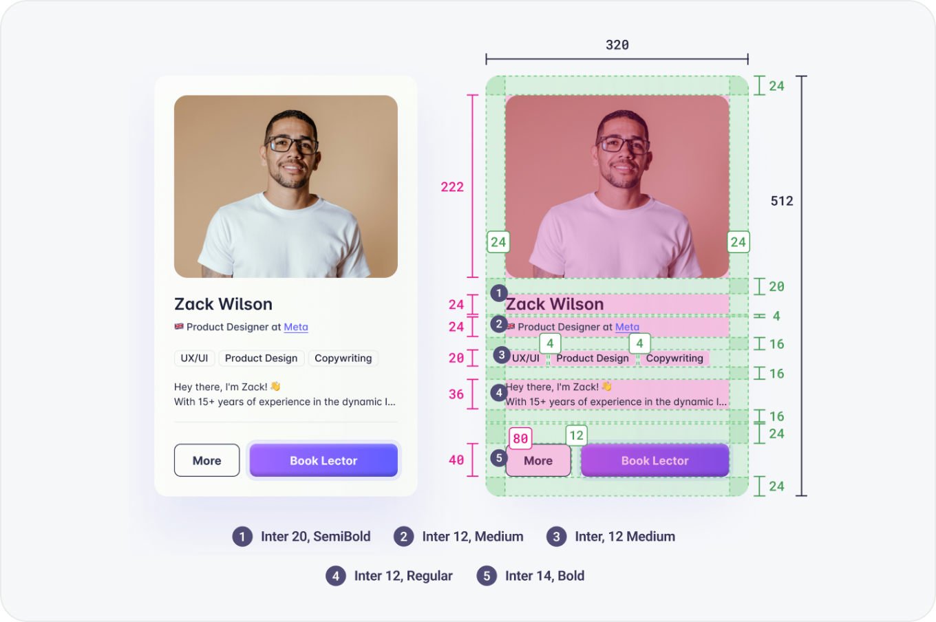
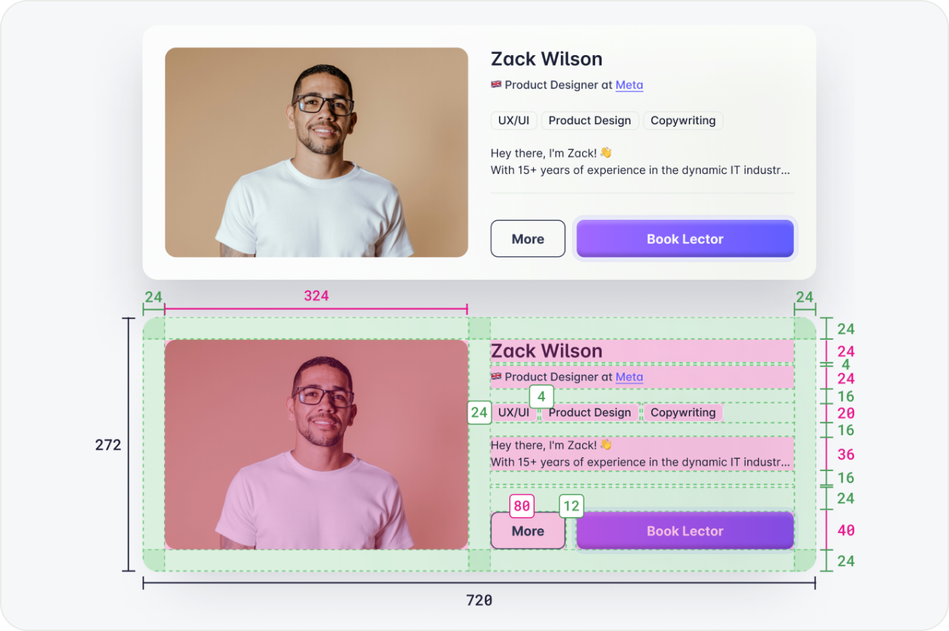
The images below show the spacing and type styles used in this card. A consistent 8pt grid and a clear type hierarchy are what make it feel finished.