UX/UI Design
Design Systems
A start to finish guide to building a design system that survives a real product team: foundations, tokens and the pipeline that ships them, library structure, component APIs, states, accessibility, release process, governance, adoption and measurement. Written for the designer who owns the system or is about to.
Muhammad Saud Musaddiq14 min read
What a System Is
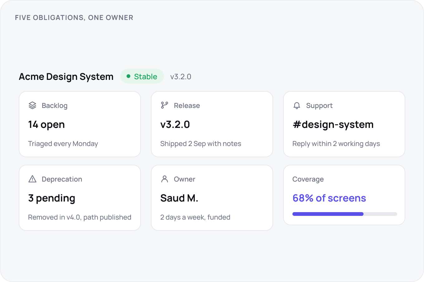
A design system is a product, not a file. Five things separate the two: a backlog you triage on a schedule, releases you announce, a support channel with a stated reply time, a deprecation policy and a named owner with hours allocated. If any one is missing you have a Figma library with good intentions, and it degrades the day its enthusiast changes teams. Judge the system by converted screens, never by components published.
The Audit and the Consolidation
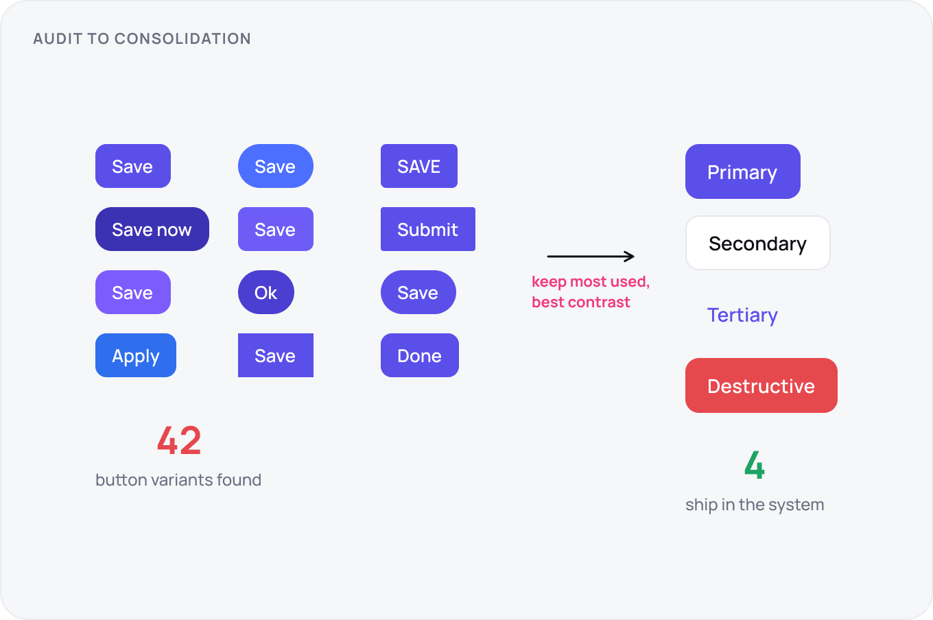
Before building anything, inventory what exists: every button, input, colour and type style across the product, with a count of near duplicates. That count is your baseline and the number you report against later. Consolidate with a written rule, keep the variant with the most usage or the best accessibility, and record every kill so nobody reintroduces it. Most teams find 30 to 60 button variants; the system ships with four.
Buy, Extend or Build
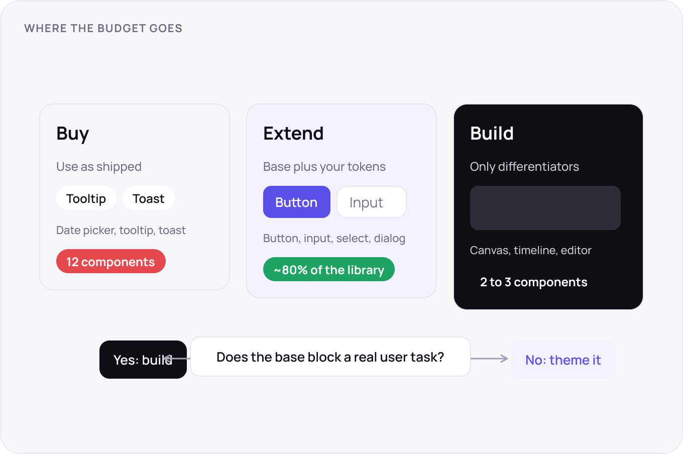
Extend an open base such as Radix, shadcn, Material or Ant unless a component is a genuine differentiator. Base kits give you keyboard behaviour, focus management and screen reader semantics for free, which take a team months to get right. Build custom only where the product wins or loses, usually two or three components. The blocking test: if the base component prevents a real user task, build; if it just looks different, theme.
Colour and Type
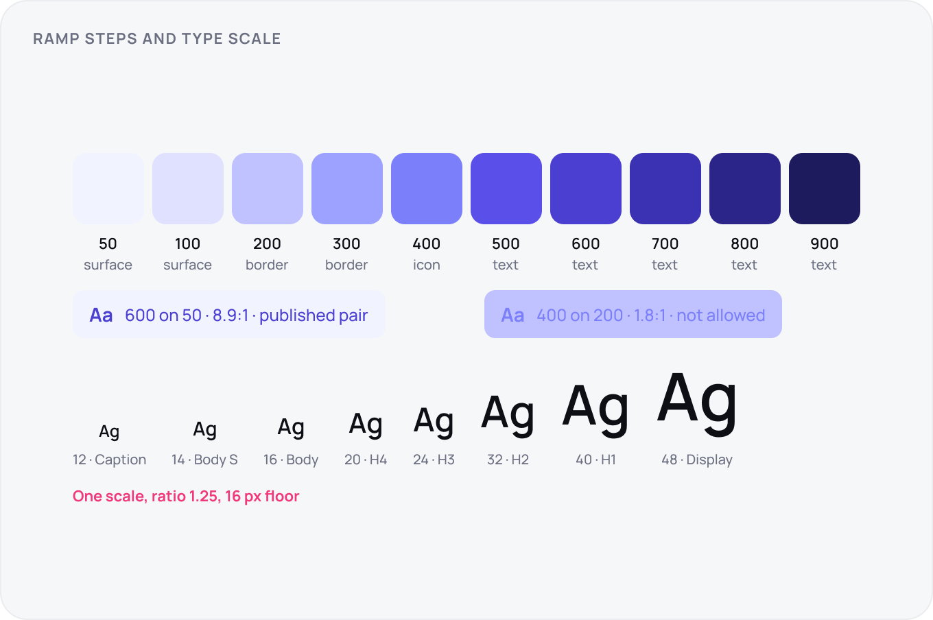
Build colour as ramps with measured lightness steps so that step 600 on any hue passes text contrast on step 50. Publish the allowed pairs, not just the palette, and mark which steps are for surfaces, borders, icons and text. Type is one scale, usually eight sizes from 12 to 48 with a 1.2 to 1.25 ratio, a 16 px body floor on the web and line heights fixed per size, not per use.
Space and Layout
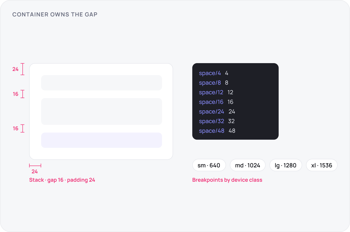
Spacing is a scale on an 8 pt base with a 4 for fine cases: 4, 8, 12, 16, 24, 32, 48, 64. Ship layout primitives, Stack, Inline, Grid and Container, so screens compose from tokens rather than hand set margins. Name breakpoints by device class, not pixel, and let the container own the gap between children so a component never carries outside margin.
Surface and Motion
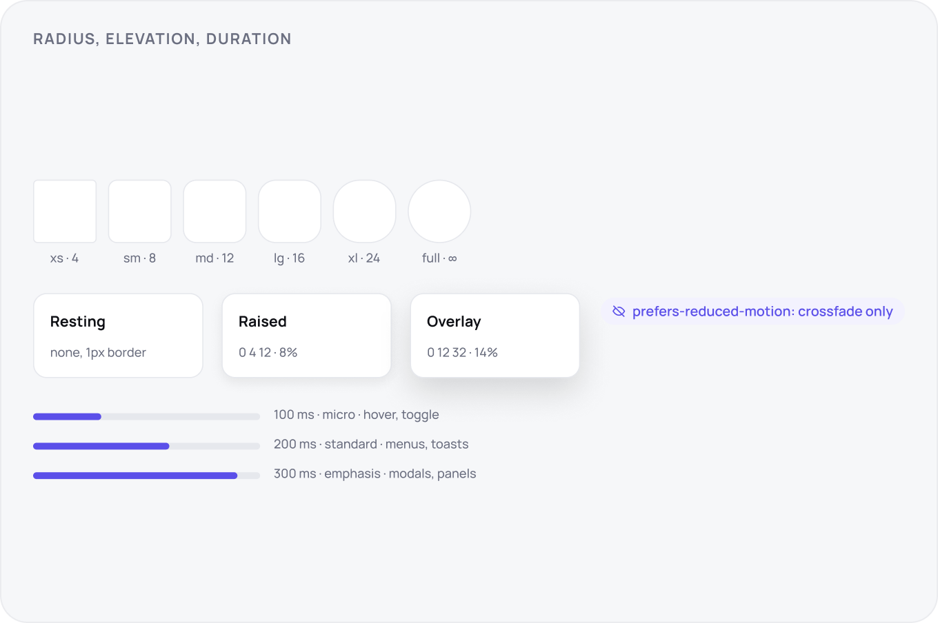
Radius is a five step scale from 4 to 24 plus full, mapped to component size so a chip and a card do not share a corner. Elevation is three bands, resting, raised and overlay, each a paired shadow and surface token so dark mode swaps both. Motion is three durations, 100, 200 and 300 ms, two easings, and every animation respects reduced motion by falling back to a crossfade or nothing.
Icons and Assets
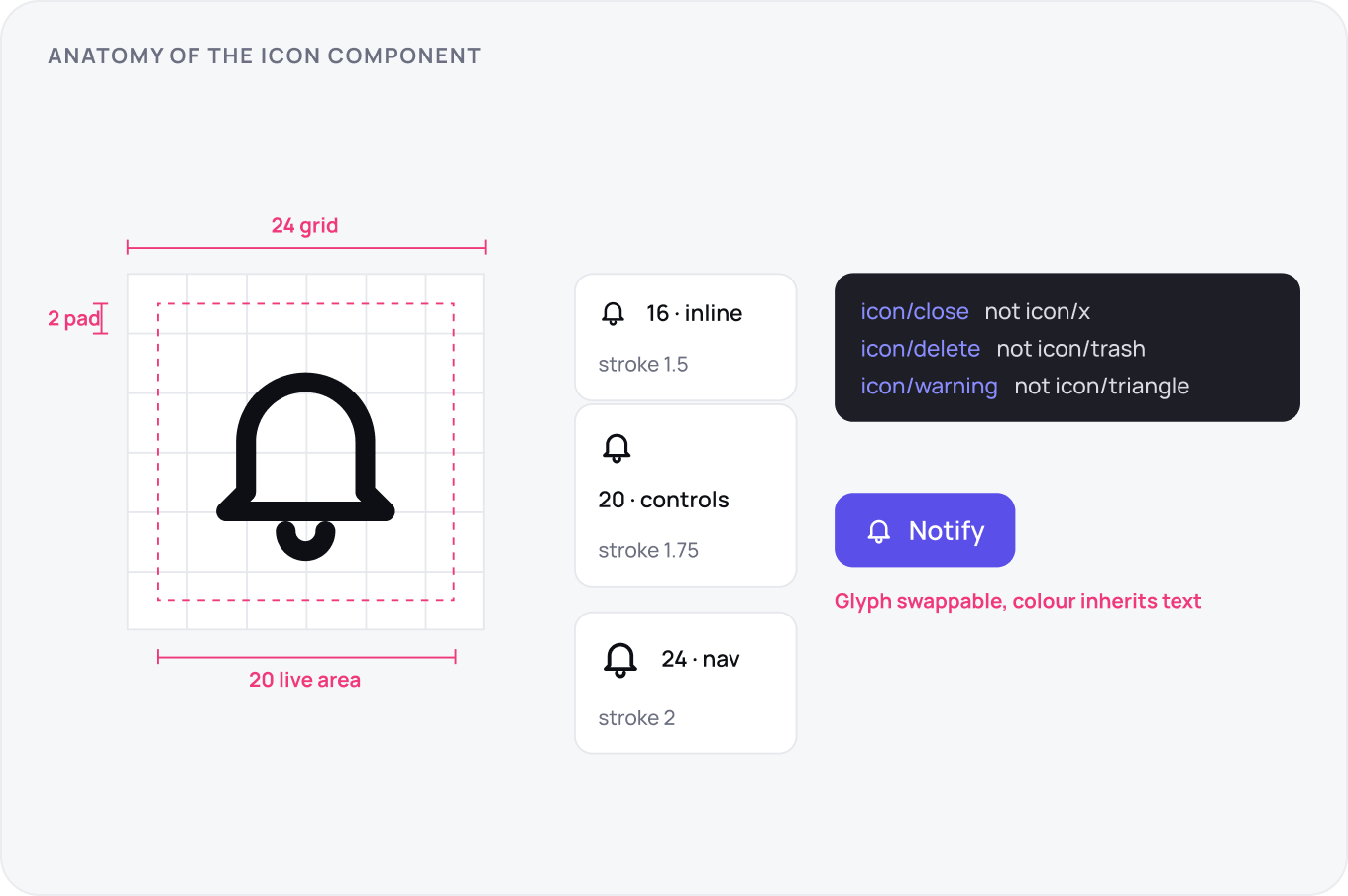
Icons live on one grid, usually 24 with a 20 live area, and ship in a fixed size set of 16, 20 and 24, drawn per size rather than scaled. Name by function, not shape: close, not x. The icon component is one component with a swappable glyph, colour bound to the current text colour, so a button never carries a hardcoded icon fill. Illustrations and logos get the same rules with their own grid.
Token Architecture
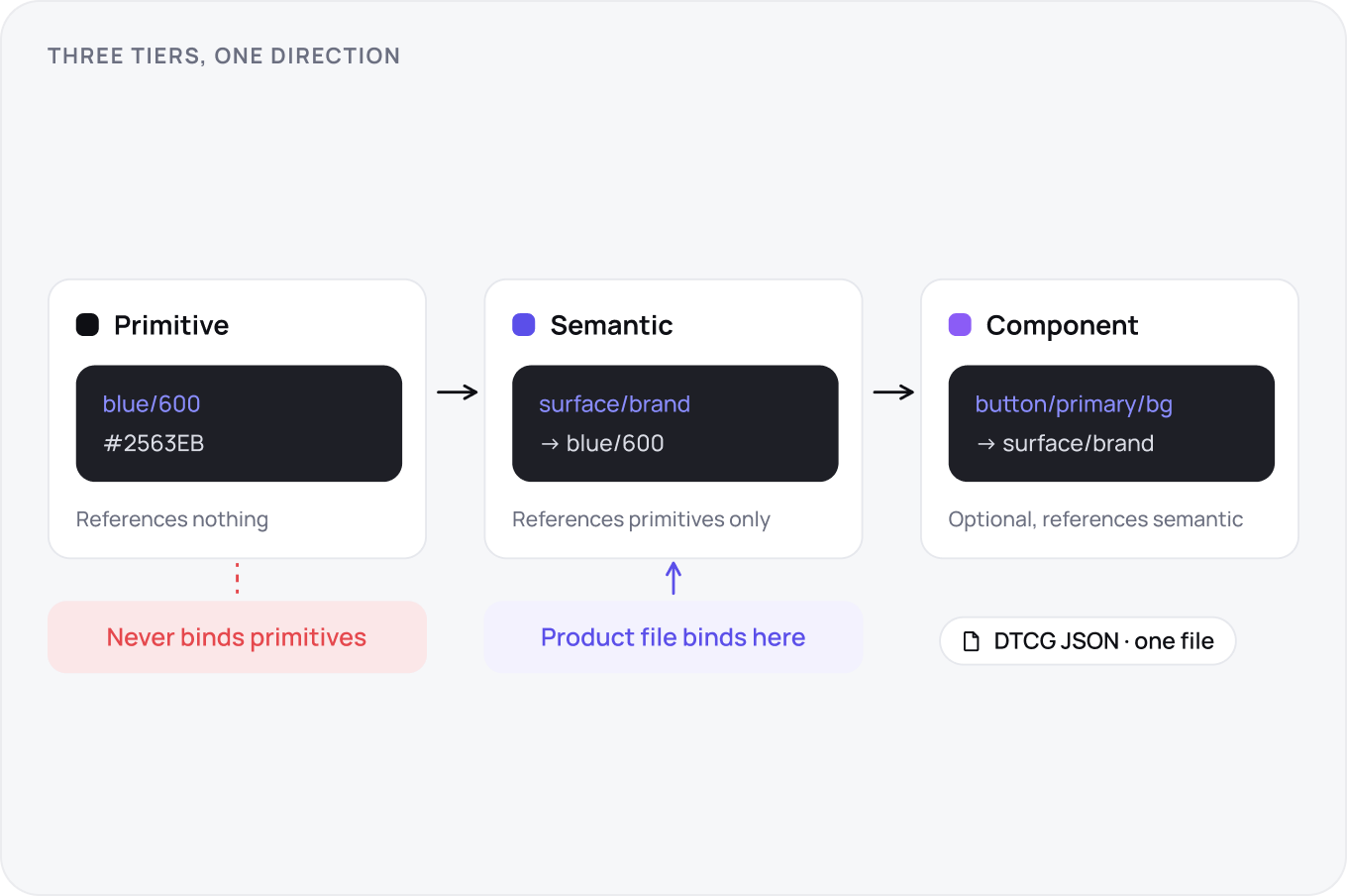
Tokens run in three tiers with one direction of reference. Primitives hold raw values and reference nothing. Semantic tokens name roles, surface-danger, text-muted, and reference primitives only. Component tokens are optional and reference semantic only. Product files bind to semantic, never primitive, which is what makes a rebrand one change. Store them in DTCG JSON so every tool reads the same file.
Theming and Modes
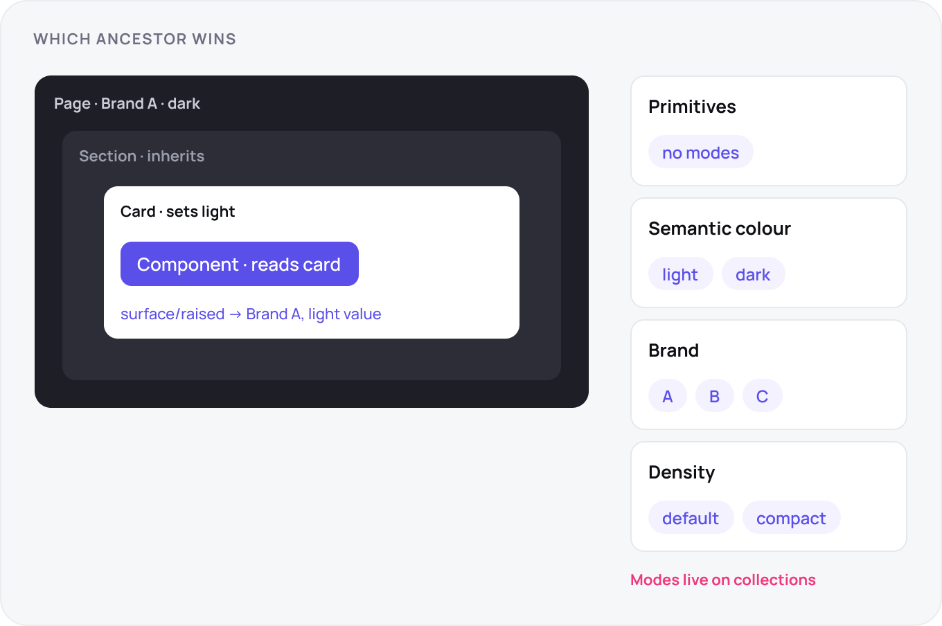
Modes live on collections, so collection architecture is theme architecture. Most teams land on four: primitives with no modes, semantic colour with light and dark, a brand collection that overrides a small set of semantic roles per brand, and density with default and compact. Resolution follows the nearest ancestor that sets a mode. In dark mode elevation is lighter surface, not deeper shadow.
Shipping Tokens to Code
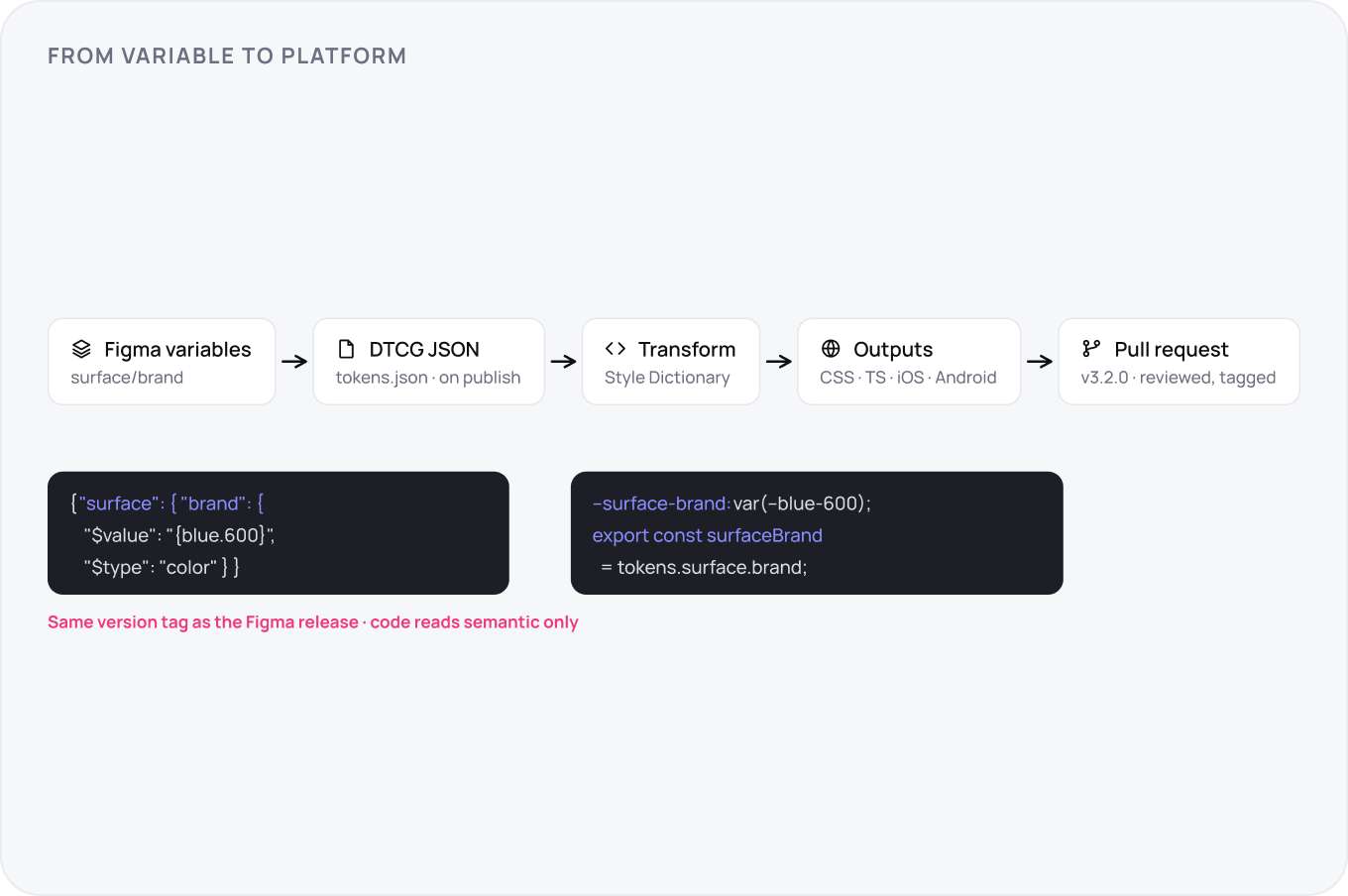
Figma variables do not sync to code on their own, so build the pipeline once: export to DTCG JSON on every library publish, transform with Style Dictionary or Tokens Studio into CSS variables, TypeScript and platform formats, and merge through a pull request tagged with the same version as the Figma release. Code consumes semantic names only. When a designer changes surface-brand, the CSS variable changes with the next merge and nobody has a handoff meeting.
Library Structure
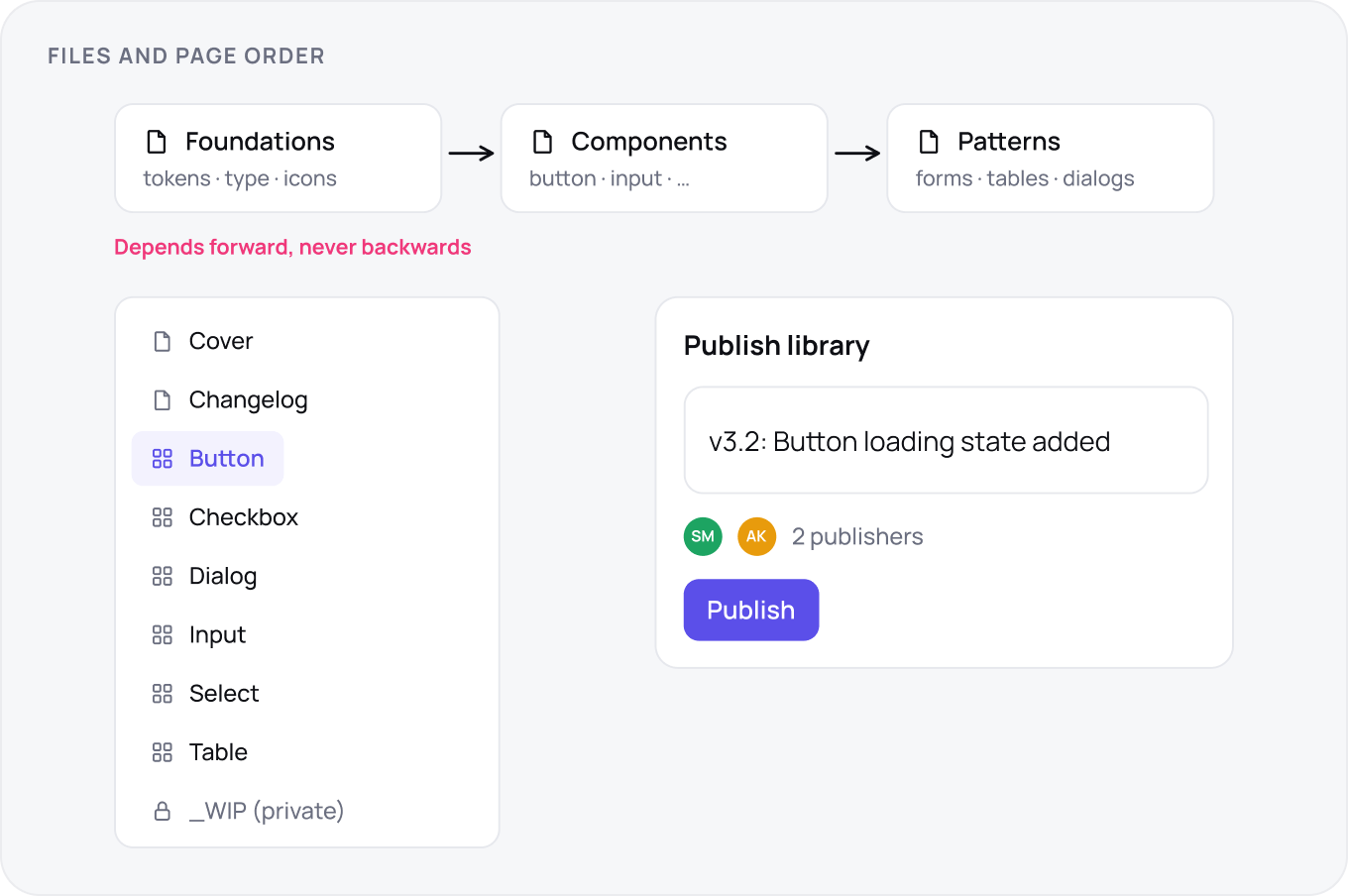
Split into foundations, components and patterns files that depend in that order and never backwards. Inside a file, page order is the navigation: cover, changelog, then components alphabetically, with a private page for work in progress. Publish rights sit with two people, and every publish carries a description that becomes the release note.
Component APIs
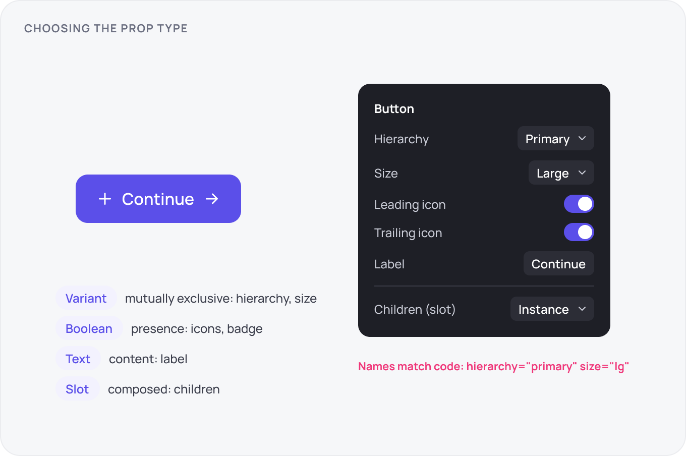
Design the API before the visuals. Variants are for mutually exclusive choices, booleans for presence, text properties for content and slots for anything the consumer composes. Keep one base component per family, so Button, IconButton and LinkButton share tokens and states. If a prop name would confuse an engineer reading the code, rename it in Figma first, the names should match.
States and Interaction
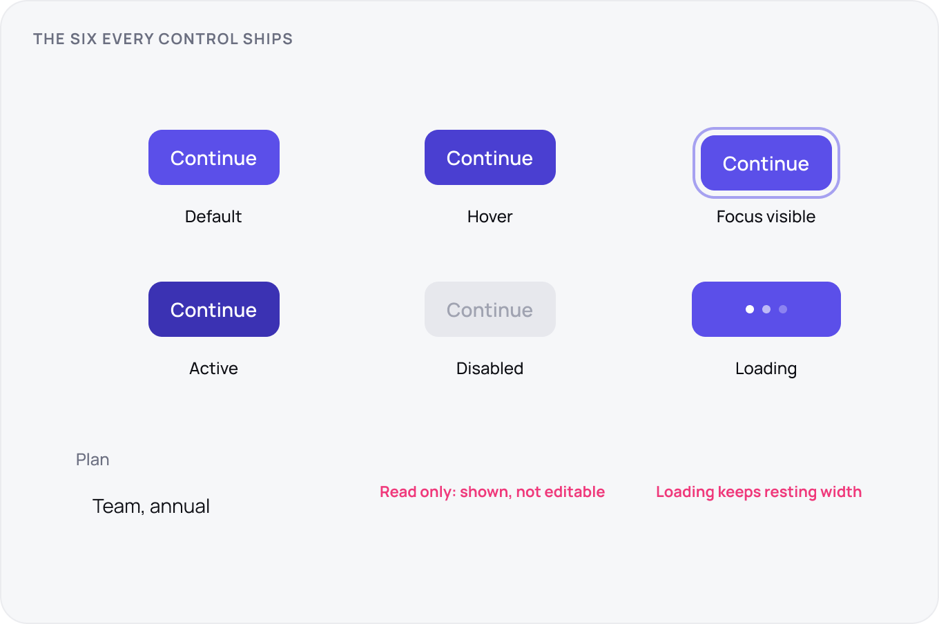
Every control ships six states: default, hover, focus visible, active, disabled and loading, plus read only where data is shown but not editable. Focus is a visible ring, never removed, drawn outside the element so it survives any background. Loading keeps the width of the resting state so layout does not jump. Error and success are content states and belong to the field, not the control.
Accessibility and Localisation
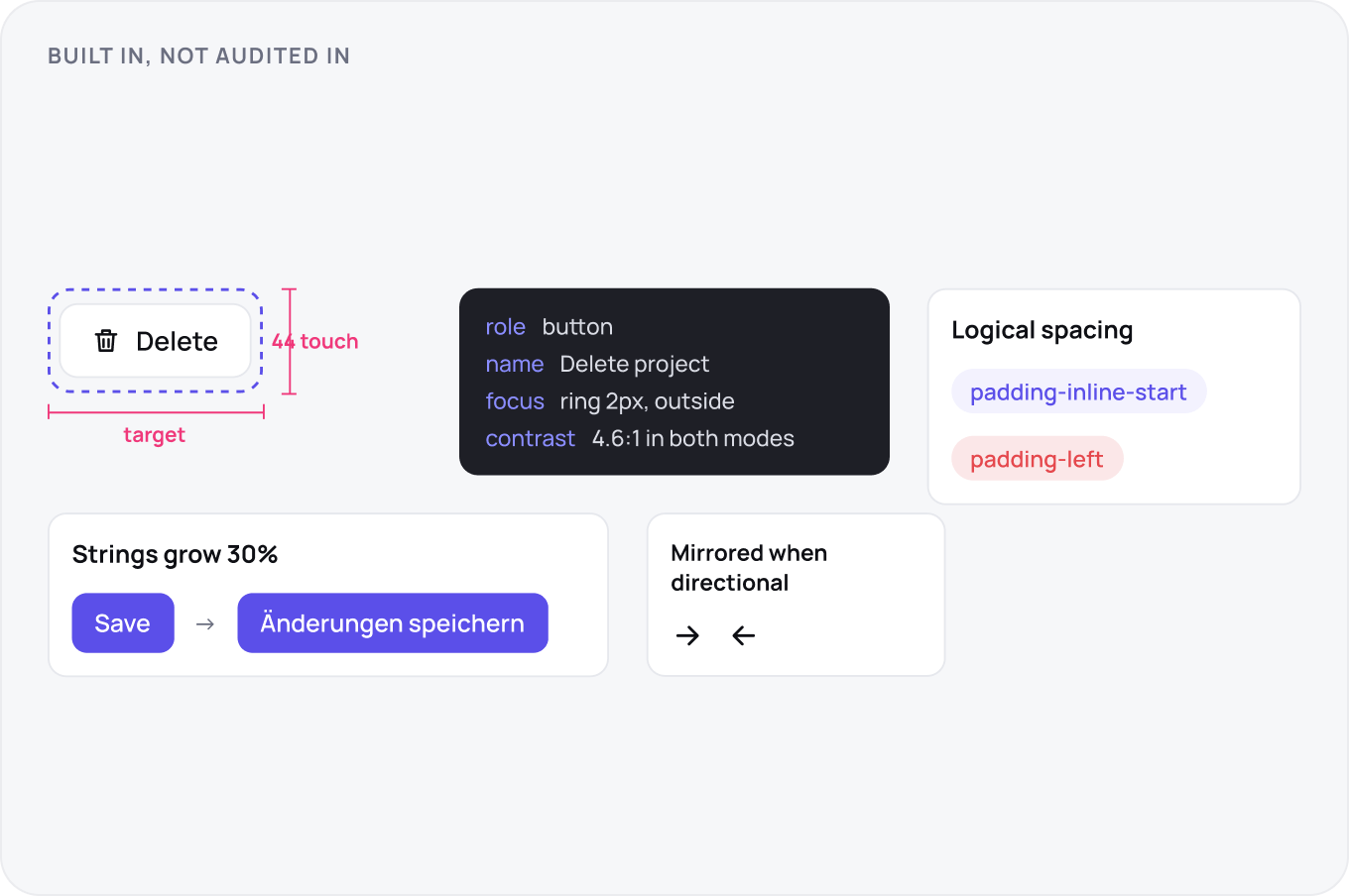
Accessibility is built into components, not audited in afterwards. Every interactive element meets 24 px minimum target on desktop and 44 on touch, has a name, a role and a focus model documented in the component page, and passes 4.5 to 1 contrast in every mode. Localisation means logical spacing, start and end rather than left and right, strings that can grow 30 percent, and mirrored icons where direction has meaning.
Patterns, Not Just Components
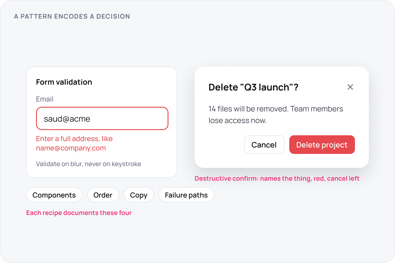
A pattern encodes a decision that components alone cannot: when a form validates, how a destructive action is confirmed, how a table handles selection and empty states. Document each as a recipe, the components used, the order, the copy and the failure paths, and ship it as a Figma page with a working example. Patterns are where product teams stop reinventing and where consistency actually appears to users.
Documentation and Copy
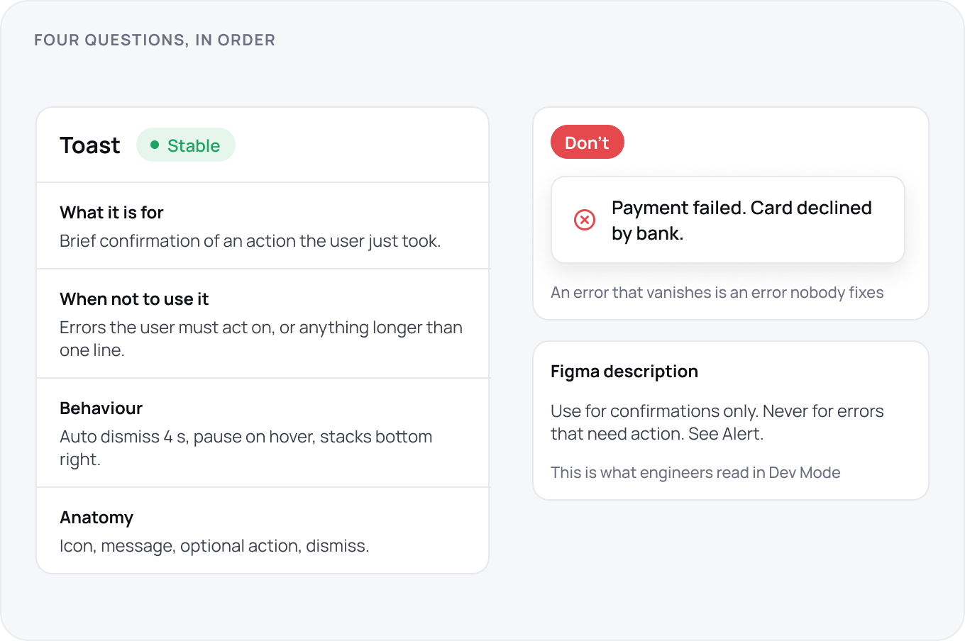
Each component page answers four questions in order: what it is for, when not to use it, how it behaves and what it looks like. Anti patterns with a screenshot teach more than guidelines. Component descriptions in Figma are the documentation engineers actually see, so write them there first. UX copy rules belong to the system too: error message structure, button label voice and empty state templates.
Dev Mode and Code Connect
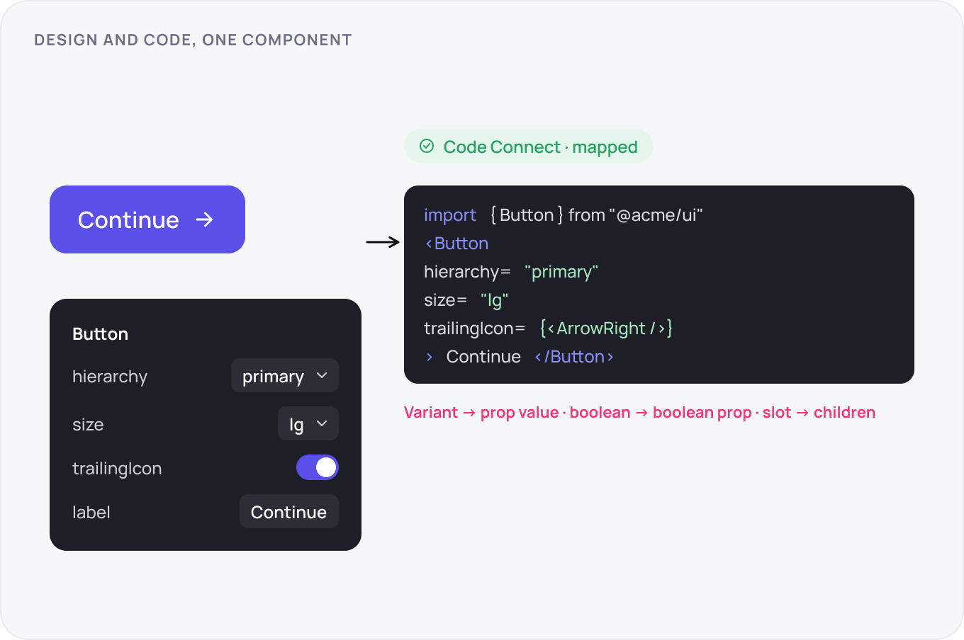
Map every published component to its code counterpart with Code Connect so Dev Mode shows the real import and the real props instead of generated CSS. Variant names map to prop values, boolean properties to boolean props, slots to children. When the mapping exists, an engineer inspecting a design copies working code, and drift between library and codebase becomes visible in the diff instead of in production.
Releases, Deprecation and Guardrails
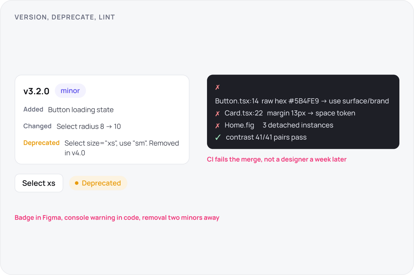
Version the library semantically: patch for fixes, minor for additions, major for breaking API changes. Every release ships notes with a migration line per breaking change. Deprecate with a named replacement, a visible badge in Figma, a console warning in code and a removal date two minors away. Guardrails run in CI: a lint that fails on raw hex values, untokenised spacing or a detached instance in a product file.
Ownership and Contribution
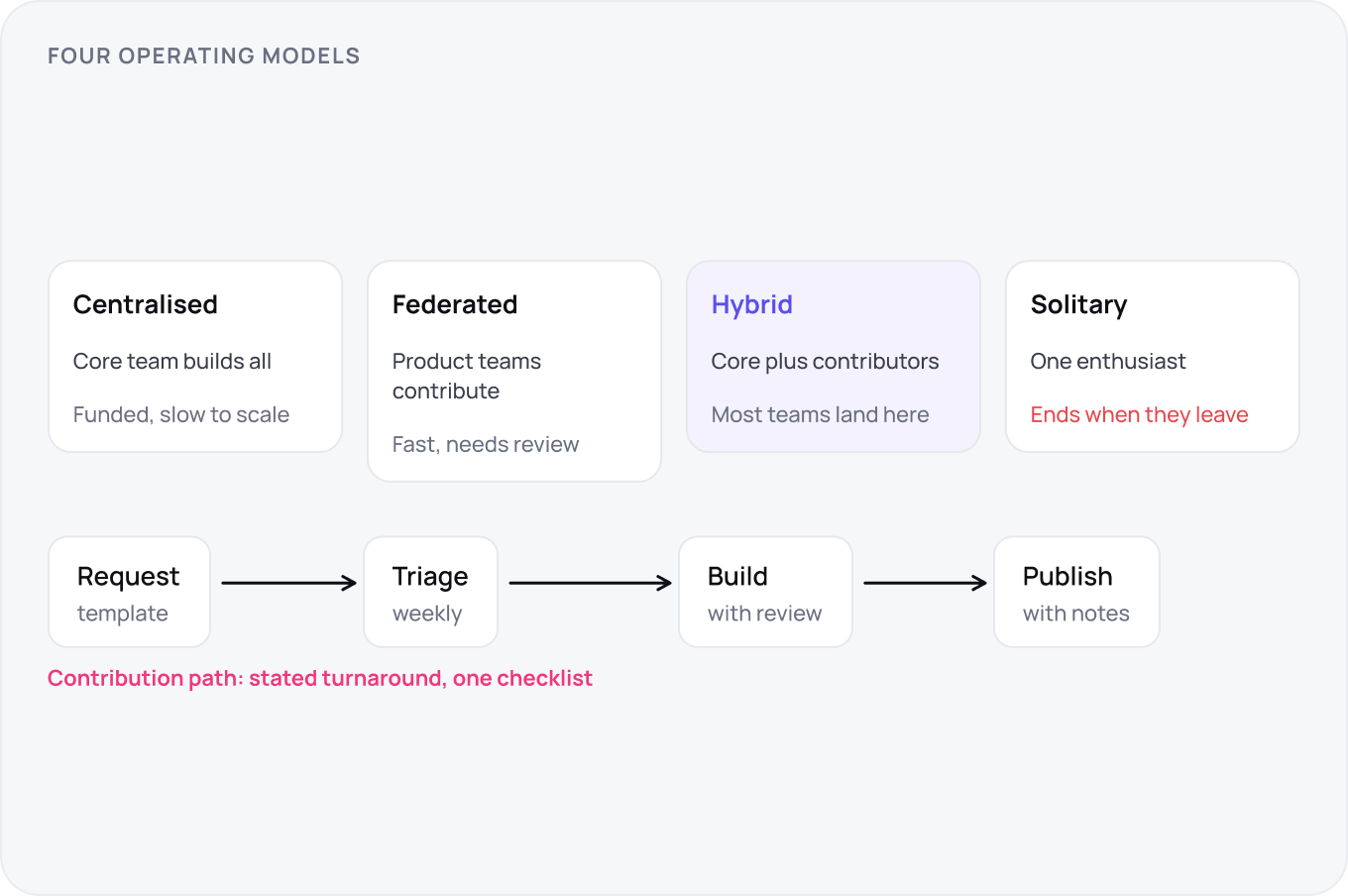
Pick an operating model and say it out loud: centralised team, federated contributors with a core, or a hybrid. Each needs funded time, a request path and a triage cadence, weekly is the minimum that keeps trust. Contribution is a documented path with a template, a review checklist and a stated turnaround. A system with no contribution path accumulates local forks, which are the beginning of the end.
Adoption and Migration
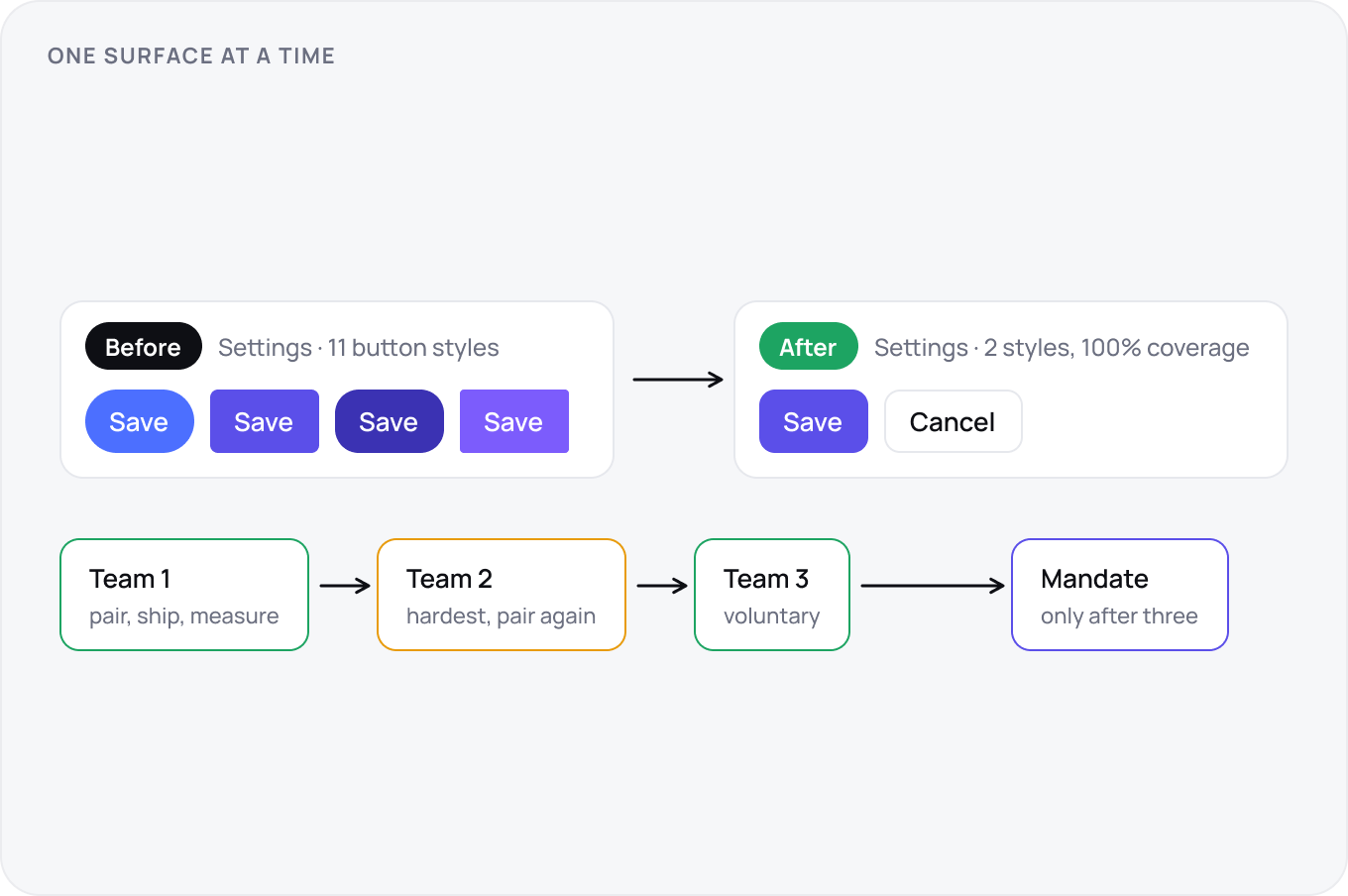
Adopt one surface at a time, starting with the screen most teams touch, and publish a before and after with the numbers. The second team is the hardest to win, so pair with them rather than handing over docs. Do not mandate before three teams have adopted voluntarily; a mandate before that produces compliance theatre, detached instances and a system nobody defends.
AI and the System
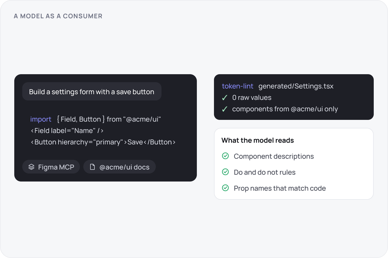
Generated UI is now a consumer of the system. Expose the library through Figma MCP or a design system package so code assistants pull real components and tokens instead of inventing them, and run the same token lint on generated code as on human code. The documentation site is the context the model reads, so keep component descriptions, do and do not rules and prop names current. A system that a model can use correctly is one that humans can too.
Measuring and Failure Modes
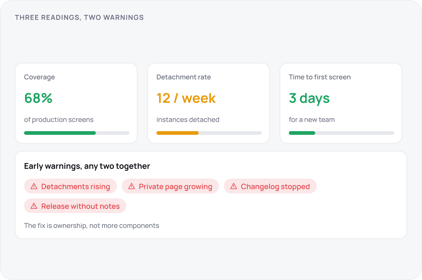
Track three numbers: coverage, the share of production screens built from the system; detachment rate, instances detached per week; and time to first screen for a new team. Failure shows early as rising detachments, a growing private page, a changelog that stops, or a release that breaks without notes. Any two together mean the system is losing and the fix is ownership, not more components.