UI Design
The 7 Types of UI Icons and When to Use Each
This article explores the seven most common types of UI icons, explaining their visual characteristics, strengths, and best use cases to help designers choose the right style for their interfaces.
Muhammad Saud Musaddiq6 min read
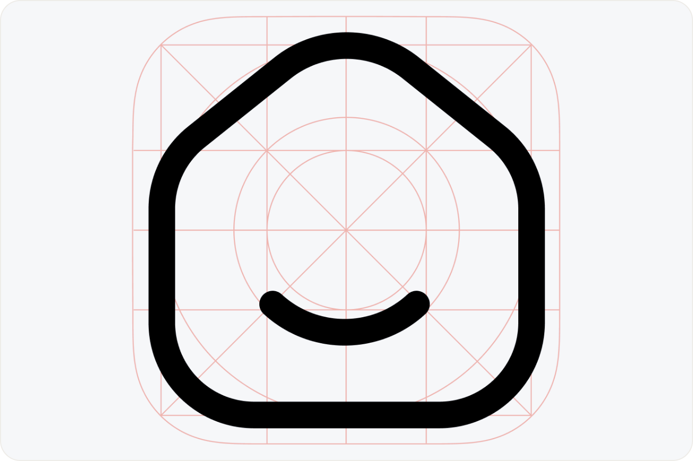
Linear
Linear icons are simple outline-style graphics with no fill, making them one of the most versatile choices in UI design. Their clean and minimalist appearance improves readability, scales perfectly across different screen sizes, and works especially well in modern interfaces where clarity, consistency, and ease of use are essential.
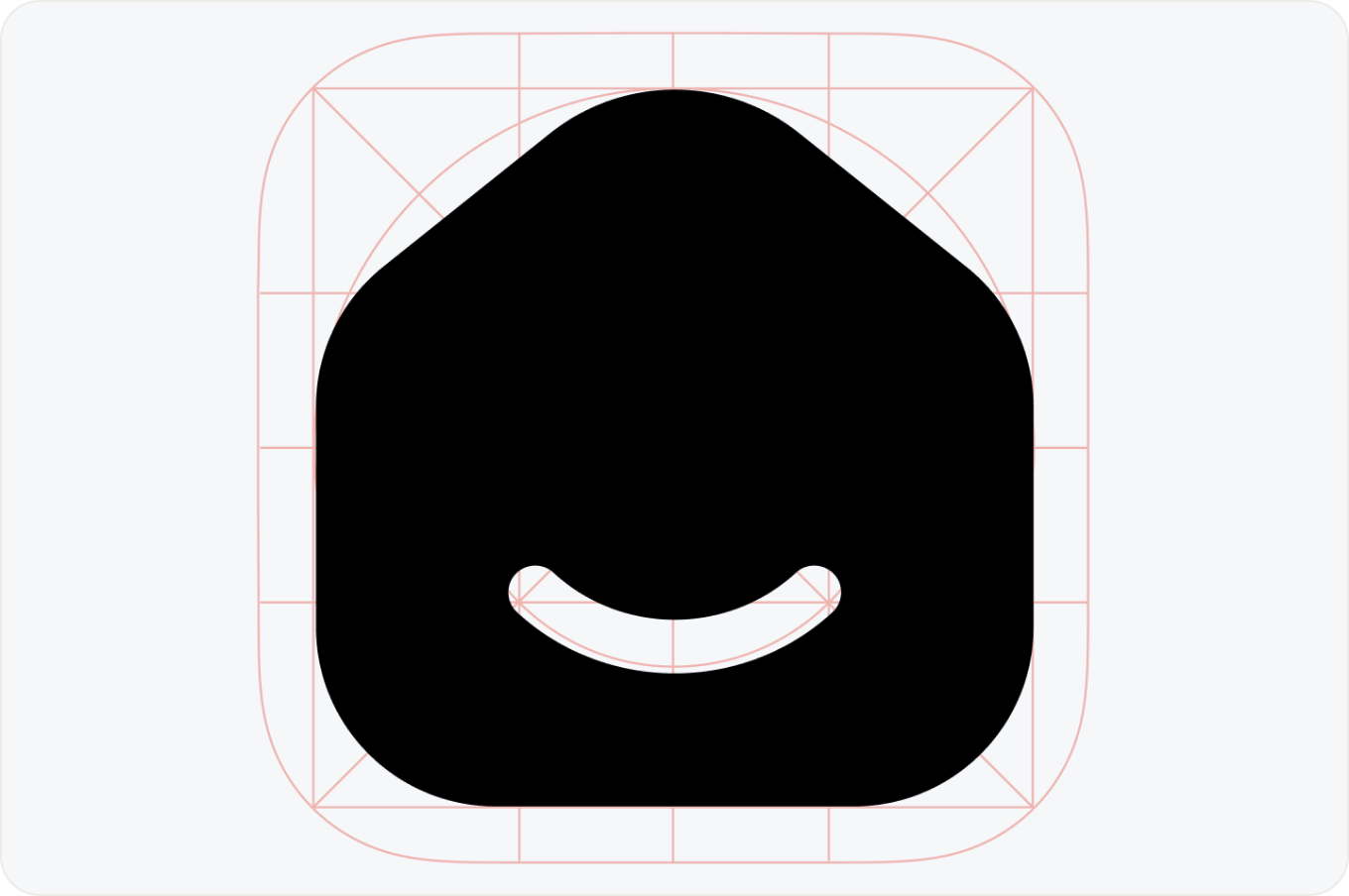
Bold
Solid icons are fully filled shapes with a bold visual presence, making them ideal for highlighting primary actions and the most important interface elements. Their strong contrast improves visibility, helps users quickly identify interactive components, and creates a clear visual hierarchy in navigation and user interfaces.
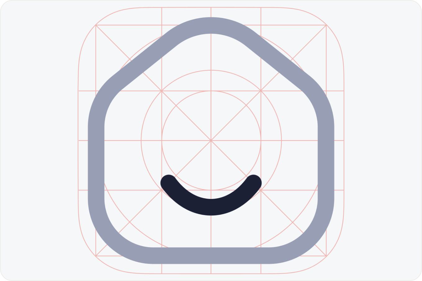
Duocolor
Duocolor icons use two contrasting colors to create greater visual depth, improve recognition, and emphasize important interface elements. They are commonly used in dashboards, data visualization tools, and modern applications where color helps communicate hierarchy, highlight key actions, and make complex interfaces easier to navigate.
Bulk
Bulk icons are heavily filled shapes with soft corners and rounded proportions, giving interfaces a friendly, modern, and approachable appearance. Their bold yet playful style makes them ideal for consumer apps, onboarding screens, illustrations, and products that aim to create a warm, welcoming user experience while keeping interface elements easy to recognize.
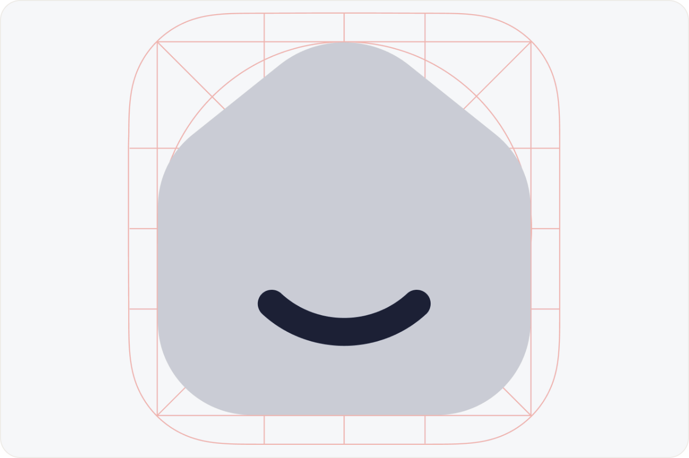
Broken
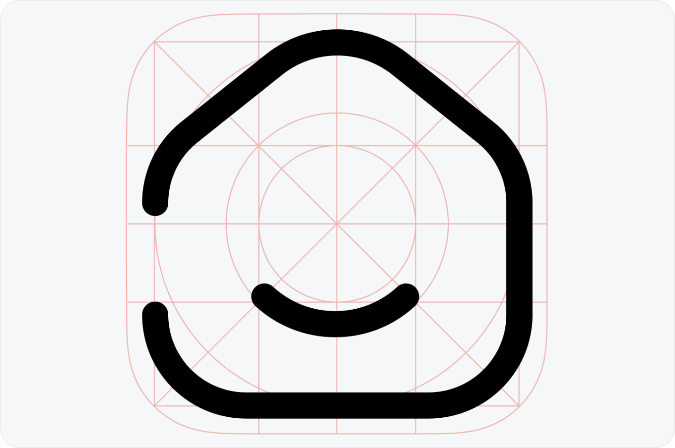
Broken icons are outline-style icons with intentional gaps in their strokes, creating a distinctive and contemporary visual style. This approach adds personality and creativity while maintaining readability, making these icons a popular choice for modern interfaces, experimental design systems, and brands looking for a unique visual identity.
3D
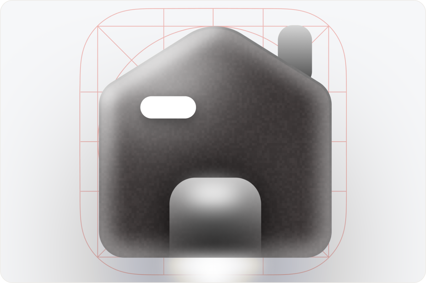
3D icons use realistic or stylized shapes with lighting, shadows, and depth to create a more immersive visual experience. They are often used in premium products, marketing websites, and modern applications to make interfaces feel more engaging, tactile, and visually memorable while drawing attention to key elements.
Illustrated
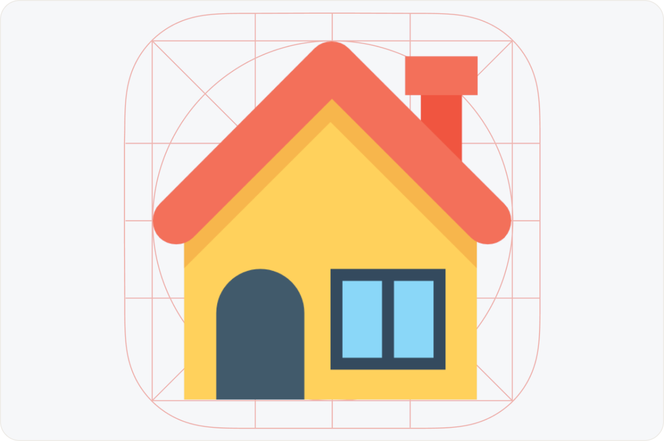
Hand-drawn icons feature detailed, sketch-like illustrations that bring warmth, personality, and a human touch to digital interfaces. They are commonly used in onboarding flows, marketing pages, and storytelling experiences to create a more engaging visual style, strengthen brand identity, and make products feel more approachable and memorable.
Packages
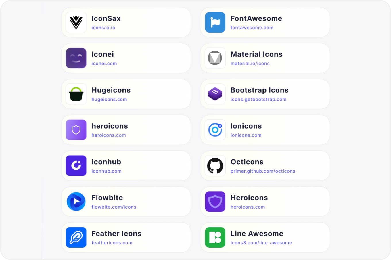
Here’s the list of my all-time favorite packages to start with!: