Problem
Price, fee and car arrive late
The fare appears only after the pool is chosen, the cancellation fee only after it applies, and the car details are present but low in the hierarchy.
00 · Introduction
Piqla is a ride‑hailing app in Antananarivo with a company fleet and local drivers. This concept redesigns the customer booking flow around the price, the cost of cancelling and recognising the right car.
Challenge
The live app shows the fare only after a driver pool is chosen, states the cancellation fee only after acceptance, and lists driver, plate and car in a hierarchy that is hard to scan at the kerb.
Objective
State the estimated fare before the pool is chosen, state what cancelling costs on every screen where it is possible, and make driver, car and plate one scannable card.
A personal concept, not affiliated with Piqla. Fee rules come from the live app, marked as proposals where they go further; section 13 compares one task under one rule.
01 · The case in brief
Problem
The fare appears only after the pool is chosen, the cancellation fee only after it applies, and the car details are present but low in the hierarchy.
Key decision
Three decisions: price before commitment, the cost of cancelling and waiting stated where it applies, and one scannable driver card.
Evidence
Reading the live app, four rounds of heuristic self‑review on the prototype, and the fee rules reconstructed from the app’s own screens.
What the concept delivers
Same four screens to request a ride, with the estimated fare moved from step four to step three; promo and payment become rows; cancelling shows its cost and a line‑item confirmation.
02 · The baseline
The original flow asks for pickup and destination on separate screens, prices the ride only after the pool is chosen, and keeps identity and fee information present but easy to miss. It works; it asks the rider to notice a lot.
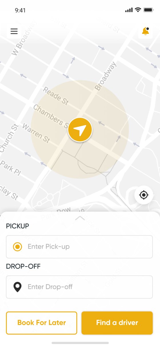
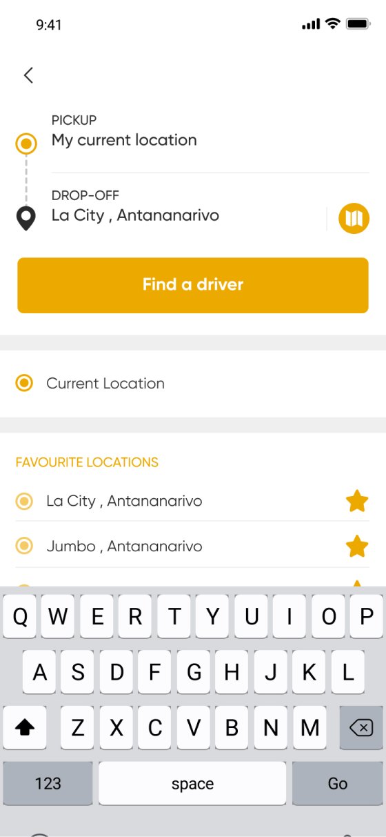
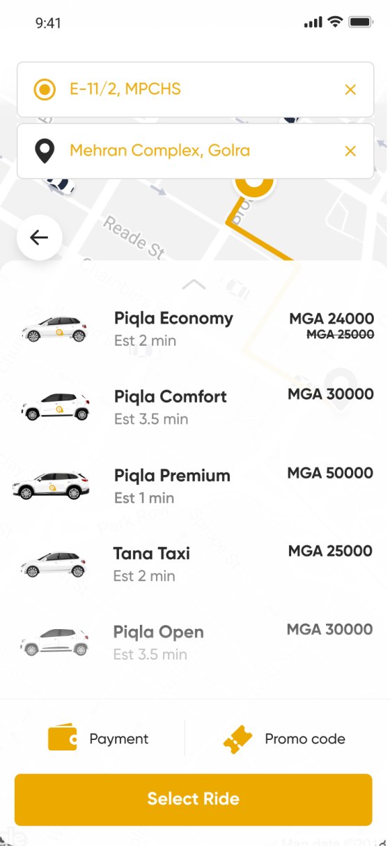
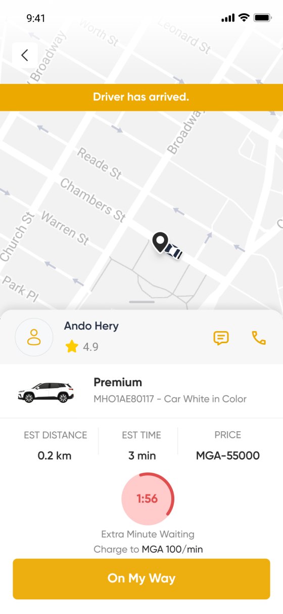
The original flow has 13 screens; four are shown here.
01 · Choose
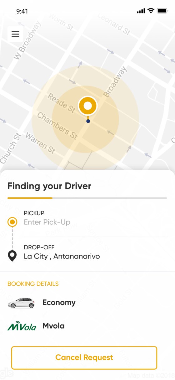
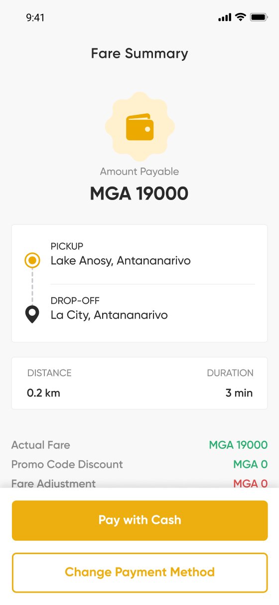
The pool is picked first; Economy, Comfort and Premium are priced only after it.
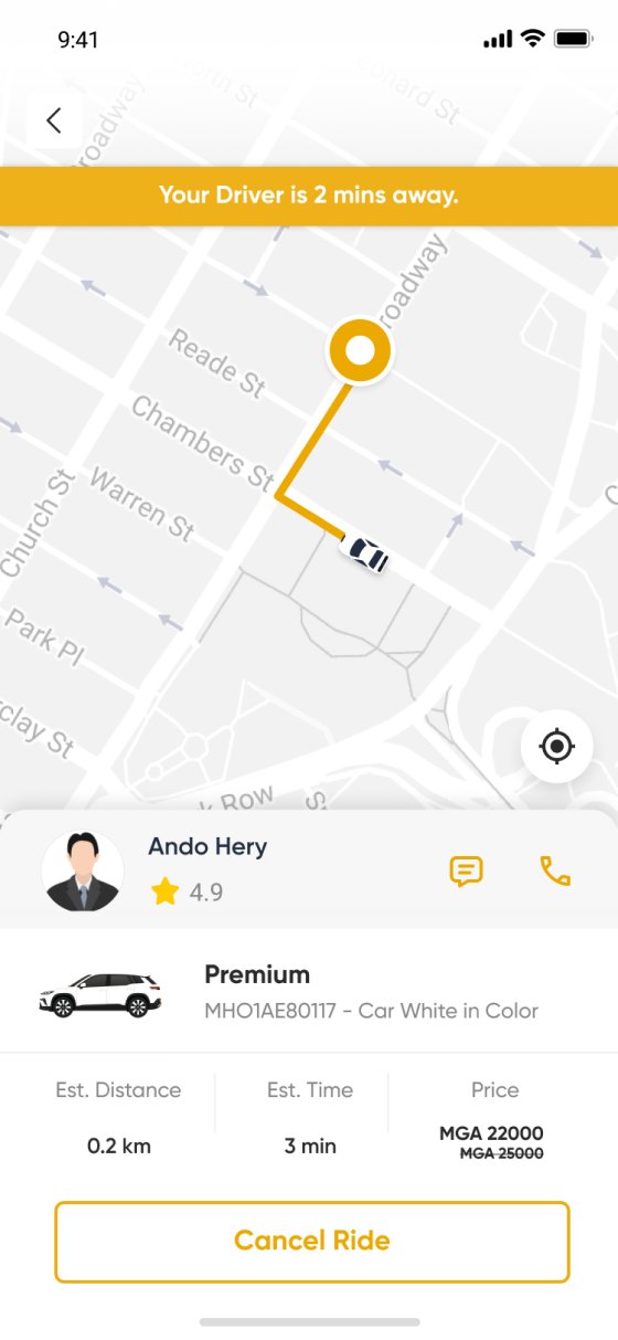
02 · Wait
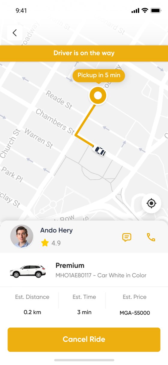
The free window and the MGA 1,000 fee appear only after the cancel popup opens.
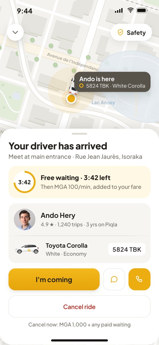
03 · Meet
Name, rating, car and plate sit together, but the plate is 12px grey text.
These are interface findings from reading the live app. No riders were observed; section 13 describes the review that followed.
03 · Product audit
I read the live app as a first‑time rider, as a daily rider and as the trip it produces. Four findings recurred; each is stated as what the screens show, not as what they lack.
Piqla or Non Piqla has to be chosen before any price appears. The pools differ in how the fare is set, fixed by Piqla or offered by a local driver, but the screen that asks for the choice explains neither.
Pickup and drop‑off are entered on separate screens; the ride request shows categories and prices but not the route. The rider confirms a fare for a trip they can no longer see.
The free window and the MGA 1,000 charge are not stated before the cancel popup. The MGA 100/min waiting rate is on the arrival screen, but not on the screens where the rider decides whether to wait or leave.
Name, rating, car and plate are on the arrival screen together, but the plate is small grey text in a line with the colour. The facts are there; they are not what the eye lands on first.
Supporting principles, not rider validation
Choice architecture
Supports finding A
When options are labelled by brand rather than by consequence, people default to the first one. Fixed versus bid fares is the consequence that matters.
A persistent summary
Supports finding B
A persistent summary reduces the state a person has to hold while deciding; the live app had none between step three and the fare summary.
Fee rules, reconstructed
Rule behind finding C
Rules reconstructed from the live app: free before a driver accepts, MGA 1,000 after, MGA 100 per minute after five minutes of waiting. Whether paid waiting is charged on top of a cancellation is stated nowhere; this concept proposes a rule and shows it in section 09.
Hierarchy before information
Direction for finding D
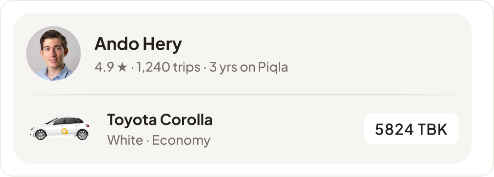
Photo, model and colour, plate: the fix is hierarchy and legibility, not more information. The plate becomes a chip; the car gets a picture; the card is the same on three screens.
04 · Strategy
Each move answers one finding. Together they put the price, the cost of cancelling and the car where the rider decides.
Move 01
Answers AThe fare appears on the destination screen as an estimate and is fixed on the ride screen. Piqla and local drivers become tabs on the same list, each with one line that says how its price is set.
Before
The pool is picked first; the price arrives on screen 4
After
An estimate on screen 3, the fixed fare on screen 4
Move 02
Answers BA grey route card holds pickup, destination, fare and promo while booking. After booking it compacts: the driver screens lead with the next decision and keep the trip one tap away. The principle is access, not repetition.
Before
The request screen shows prices, not the route
After
One route card from screen 2, compact after booking
Move 03
Answers CEvery screen with a cancel button says what cancelling costs now, and the confirmation itemises it: cancellation, any paid waiting, the total added to the next ride.
Before
The free window and the fee appear only after the cancel popup
After
Each cancel states its cost; the confirmation itemises it
Move 04
Answers DPhoto, name, trust line, car picture and the plate as a chip in one card, identical on the arriving, arrived and in‑trip screens.
Before
The plate is small grey text in a line with the colour
After
Photo, car picture and plate chip, the same on three screens
05 · The flow and its rules
The flow is linear. The only branch is the driver pool on screen 4; this concept designs the fixed‑fare pool and marks the other. Cancel is a confirmation sheet over screens 5 to 7 that itemises the cost before anything happens.
Pickup detected, results with a from‑fare, and one sheet that states the estimate before any pool.
A fixed fare, tiers that say what the extra money buys, promo and payment as rows.
One identification card, and the cost of cancelling beside every cancel.
The cost itemised before anything is charged, and where the money goes.
Progress that agrees with the car, a receipt kept apart from the rating.
The rules the flow depends on
Nothing here was agreed with Piqla; each rule would need its owner before build
| Rule | Status | What it says | Where it shows | Sign‑off from |
|---|---|---|---|---|
| Fare | Read from the app | Piqla fleet: fixed by Piqla. Local drivers: set by the driver. | The pool tabs, screen 4 | — |
| Cancellation | Read from the app | Free before a driver accepts; MGA 1,000 after. | Screens 5, 6 and 7 | Operations |
| Waiting | Read from the app | Five minutes free, then MGA 100 per minute. | Screen 7, the timer card | Operations |
| Grace window | Proposed | Two minutes after acceptance are also free, so a mis‑tap costs nothing. Drivers lose a little certainty early on. | Screen 6, the countdown | Operations, driver relations |
| Fee stacking | Proposed | If paid waiting has started, it is added to the cancellation fee and itemised before confirming. | The cancel sheet | Operations, payments |
| Payment and promo | Assumed | Mvola by default; one promo per ride, and a new one replaces it. | Screen 4 rows, screen 9 receipt | Payments |
| Identification | Assumed | Photo, car and plate come from the driver record, which the card assumes is verified. | Screens 6, 7 and 8, the driver card | Not assigned |
| Local‑driver pricing | Out of scope | Drivers set their own price; how an offer is made, accepted or expires is not designed here. | The local drivers tab, screen 4 | Marketplace |
06 · Choosing a destination
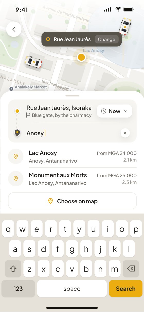
Screens 1 to 3 take the rider from the map to a priced trip: the pickup is detected, results carry a from‑fare, and one sheet states the estimate before any pool is chosen.
Pickup is detected and shown as a callout on the pin, not a form field. Saved places sit as two segments with their addresses in full, and recents follow beneath.
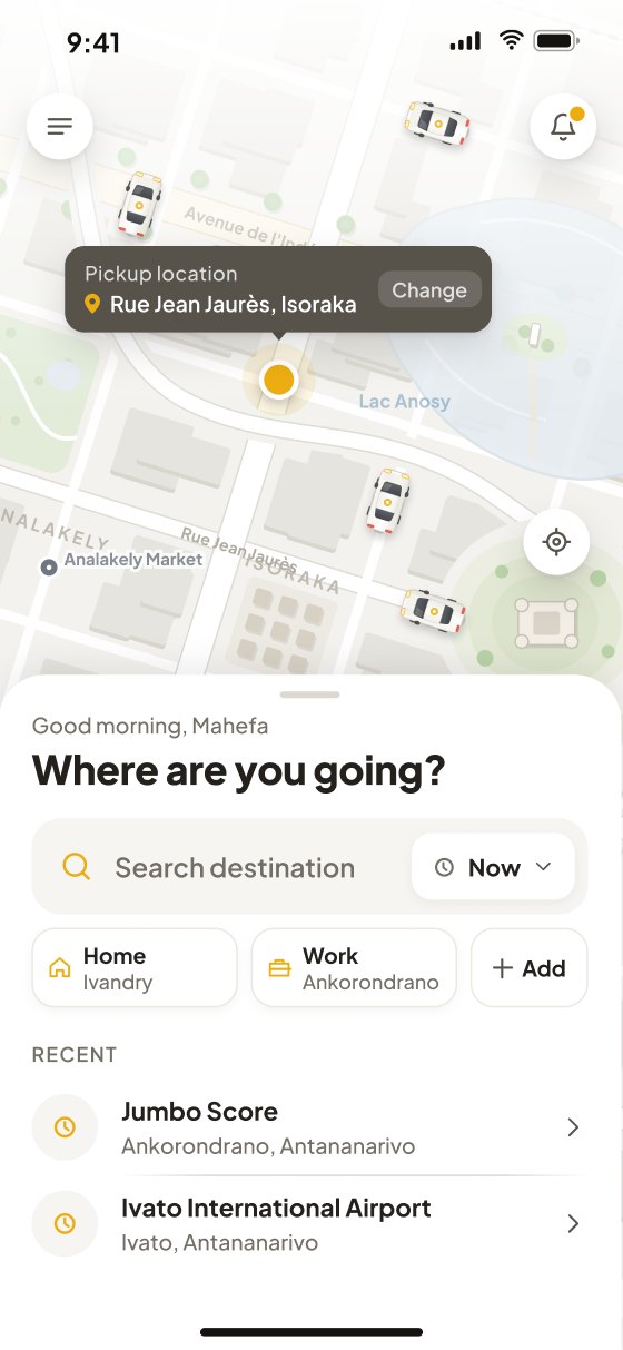
The route card appears here and never leaves. Results show distance and a “from” fare so the first commitment is informed. Choose on map is the fallback, not the default.
Pickup, destination, distance, time and the estimated fare on one sheet, with the route previewed above. Both rows are editable; the only action is Choose ride.
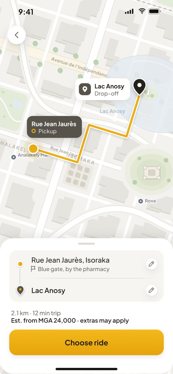
No equivalent screen in the old app
What the first three screens change
Detected and shown on the pin
Before: typed into its own fieldHome and Work, with their addresses
Before: favourites under the drop‑off fieldAn estimate before any pool
Before: priced only after the pool, on screen 4One card, both rows editable
Before: pickup and drop‑off on separate screens07 · Choosing a ride
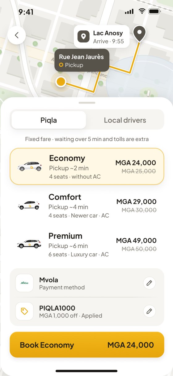
Screen 4 is the one choice the old app asked the rider to make blind. The pool now explains how its price is set, every tier says what the extra money buys, and the fare is fixed before booking.
Piqla and local drivers are tabs with a line stating how each sets its price. Every tier shows pickup time, seats and what the rider gains. Payment and promo are rows, not screens.
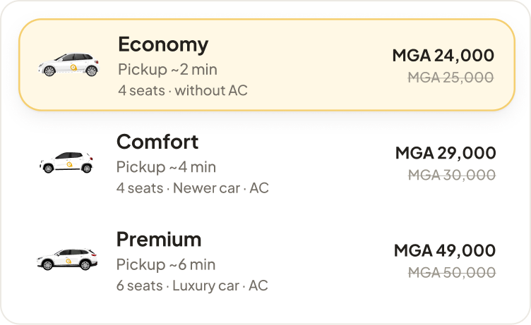
Piqla or Non Piqla is chosen before any price appears; Economy, Comfort and Premium are priced only after it.
“Fixed fare · waiting over 5 min and tolls are extra” under the Piqla tab. The local‑driver tab states that drivers set their own price; that flow is not designed here.
Economy: 4 seats, no AC. Comfort: newer car, AC. Premium: 6 seats, luxury car, AC. Each tier says what the extra money buys.
Mvola and PIQLA1000 with pencil edits, on the same grey card as the route.
08 · Waiting for the driver
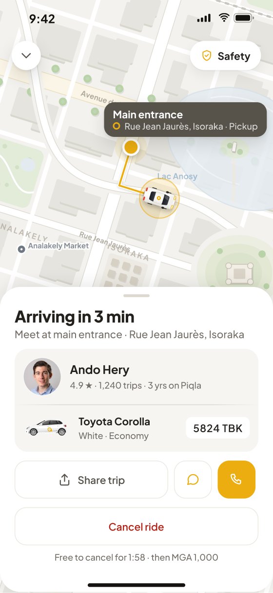
Screens 5 to 7 cover the wait. The trip card stays, one identification card carries the driver, the car and the plate, and every cancel says what it costs at that moment.
A segmented tracker names the three states. The trip card repeats the route and fare. Cancel is free until a driver accepts, and the screen says so.
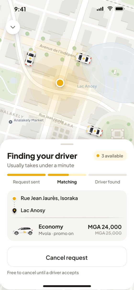
The driver card is the same on this screen, on arrival and in trip: photo, name, trust line, car at list scale, plate as a chip. The live car marker sits on the route to the pickup.
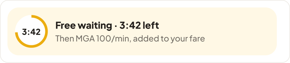
The meeting point is named in the subtitle and on the map. The waiting timer explains the rule in one line. “I’m coming” is the primary action and becomes a confirmed state when sent.
What cancelling costs, moment by moment
Screen 5
While searching
Free
Until a driver accepts.
Read from the appScreen 6
First 2 minutes after acceptance
Free
A mis‑tap costs nothing; the screen counts down from 1:58.
ProposedScreens 6–7
After the grace window
MGA 1,000
The cancellation fee, stated beside every cancel button.
Read from the appScreen 7
Driver waiting over 5 min
+ MGA 100/min
Paid waiting; added to the fee if the rider cancels, itemised first.
Rate read · stacking proposedDetail · the identification card
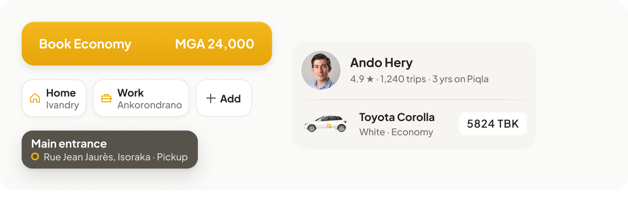
The same card on screens 6, 7 and 8: photo, name, trust line, car picture, plate as a chip.
Detail · the waiting rule
One line beside the countdown it applies to; the rate was on the old screen too.
09 · Cancelling with fees
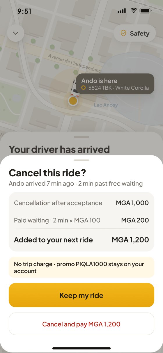
The sheet sits over screens 5 to 7 and shows the rule the old app never stated: after acceptance the cancellation fee applies, and if paid waiting has already started it is added. Seven minutes after arrival that is MGA 1,000 plus two minutes at MGA 100. Both rules are proposals; the block below shows what moves if either is declined.
Over screens 5 to 7. Seven minutes after arrival: MGA 1,000 plus two minutes at MGA 100.
Cancellation after acceptance MGA 1,000 · paid waiting 2 min × MGA 100 = MGA 200 · total MGA 1,200.
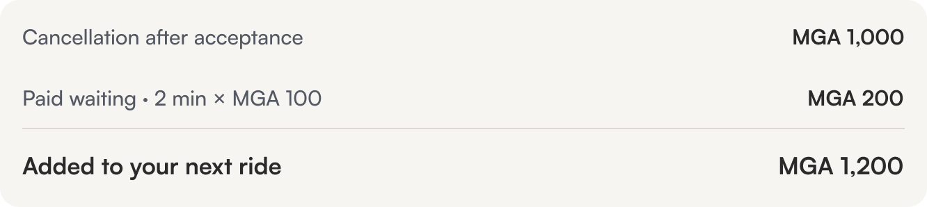
“Added to your next ride”, the live app’s own mechanism, stated on the sheet instead of discovered on the next booking.
Keep my ride is the gold button; Cancel and pay MGA 1,200 is the quiet one, with the amount in its label.
Cancelling opened a list of reasons. The free window and the MGA 1,000 charge were not shown before it, and paid waiting was never mentioned.
If the rule changes
What moves on screen if a proposal is declined
The countdown on screen 6 disappears and the cancel note reads “MGA 1,000 after acceptance”; nothing else moves.
The confirmation drops its second line and the total becomes the flat MGA 1,000.
Screen 4 needs an offer state: a price arrives after the request, with accept, decline and expiry. That is a separate piece of work.
10 · The trip and its ending
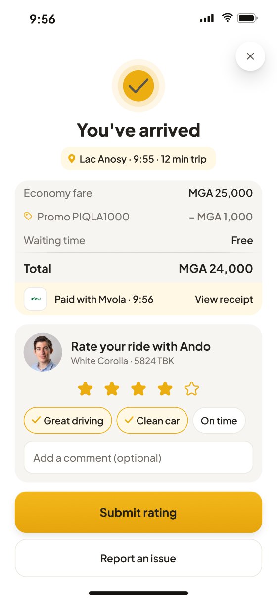
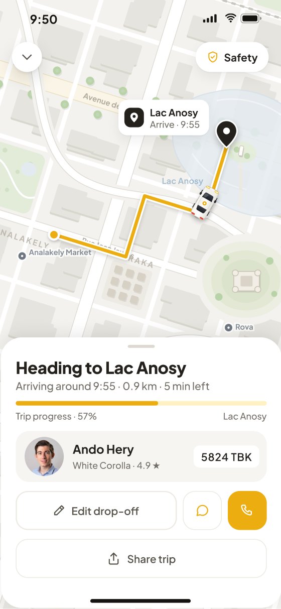
Screens 8 and 9 end the ride. The numbers in the trip agree with the car, the driver card compacts so the journey leads, and the receipt stays apart from the rating.
Arrival, distance and time left agree with the car’s position. The driver card compacts to one row so the journey leads. Edit drop‑off and Call share one outline row.
The fare card is the receipt: fare, promo, waiting, total, paid with Mvola, view receipt. The rating card is separate, unrated until a star is tapped, with chips and a comment field.
The receipt, line by line
The clocks, screen to screen
The old frames all read 9:41. Now 9:55, the arrival time shown on the way, is the pickup plus the 12‑minute trip.
11 · States and edge cases
A flow is only as good as its worst ride. These five states carry the rules that keep a trip honest. The drop‑off change is drawn in the prototype; the other four are specified here and still need frames. The cancel sheet, the other drawn exception, is in section 09.
The route card stays through every stall, so nothing is ever retyped.
A new route, fare or arrival is shown before the rider agrees.
No percentage for an unknown wait, no retry while a payment may still succeed.
Every stall offers exits, and leaving is free when the rider did nothing.
Five states · each tagged with the rules it proves
When
“Usually takes under a minute” → after 60 s: “Taking longer than usual”
The three milestones stay visible; the active one animates and the subtitle changes. Three exits appear: keep waiting, widen the search, cancel free. No percentage is ever shown because the duration is not known.
Proves: say only what is known, always a way out
When
Matching ends with no acceptance
The screen never goes blank. It offers the same three exits and keeps the route card so the rider does not retype the trip.
Proves: keep the trip, always a way out
When
Acceptance withdrawn before arrival
Rematching starts immediately with the same route card. If the new ETA or fare differs, both are shown before the rider is asked to continue, and leaving is free because the rider did nothing.
Proves: keep the trip, show a change before it lands, always a way out
When
Edit drop‑off tapped on screen 8
A confirm sheet shows the new route, the fare delta and the new arrival. Nothing changes until Confirm; Keep current is always one tap.
Proves: show a change before it lands
When
Mvola has not confirmed at arrival
Pending keeps the receipt open with “Confirming with Mvola” and no retry, because the payment may still succeed; Failed shows the reason and a retry with another method. The rating card stays available in both.
Proves: say only what is known, always a way out
12 · UI foundation
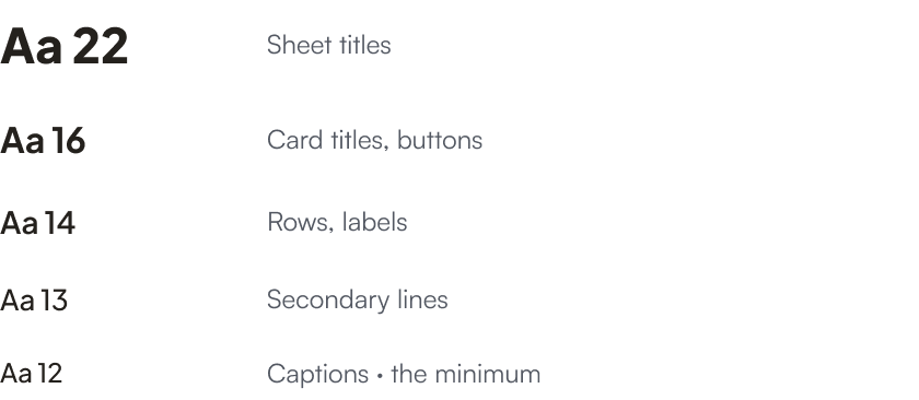
One gold, two inks, four greys and three surfaces. Plus Jakarta Sans at five sizes. Every control is 52 or 56px high with a 16px radius, every card is grey with an 18px radius, and every separator fades at its ends. All spacing sits on a 2px grid and nothing is set below 12px.
13 · What this demonstrates
Nothing here was measured with riders. These are properties of the frames, counted on one task from app open to request sent, and the changes four rounds of heuristic self‑review made.
The price appears on the fourth screen, after the pool.
The count is equal; the estimate moves one step earlier and promo and payment stop being screens.
One rule for both: screens a rider must pass through from app open to request sent, happy path. Cancel sheets, promo and payment are optional in both flows and excluded from both.
Estimated fare
See 06Step 4→Step 3
where the estimate appears
Before the pool is chosen
Promo · payment
See 072→0
screens for promo and payment
Rows on the ride screen
Cancel cost
See 081→3
screens with the cost beside the button
Plus an itemised confirmation
The car
See 083→1
groups to read to identify the car
One card on three screens
| Issue | Raised | Changed |
|---|---|---|
| The fee was a surprise | Cancel on three screens with no cost beside it; the free window and the waiting rate were never shown together, so it was unclear whether they added up. | Every cancel states the current cost, and the confirmation itemises it: MGA 1,000 plus two paid minutes at MGA 100 equals MGA 1,200, added to the next ride. |
| “3 min” three times | Map callout, badge and title all said the ETA; the pickup point itself was never named. | ETA lives in the title only. The callout names the meeting point and address; the live car marker sits on the route. |
| Clocks disagreed | Status bars read 9:41 on every screen while arrival said 9:55 and payment 9:56. | Clocks now run 9:41 → 9:42 → 9:44 → 9:50 → 9:56, and 9:55 is pickup time plus the 12‑minute trip. |
Declined with a reason: a Distance/Time/Arrival strip in the trip (the subtitle carries the same numbers), and chevrons on saved places (a tap selects at once). Reconsidered: the matching bar, which should show three milestones rather than a fill; section 11 specifies it.
What it cannot show
No sessions were run; comprehension is the open question. The screens put the price, the cost of cancelling and the car’s identity where a rider decides. Whether that is enough is what testing would tell.
Next step
A handful of sessions at a kerb in Antananarivo, with the prototype on a phone.