UX/UI Design
How to Design Data Tables
Tables carry the most information per pixel of any component and the most ways to get it wrong. This guide covers anatomy, alignment and density, column types, sorting and filtering, selection, pagination and the empty, loading and error states.
Muhammad Saud Musaddiq7 min read
Anatomy
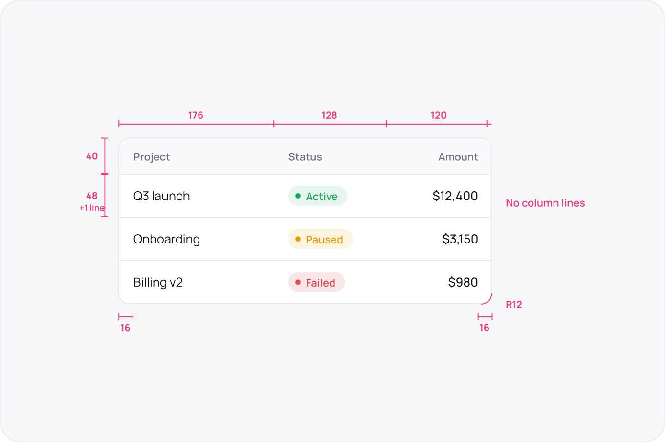
A table is a header row, body rows and cells inside a container. Header 40 high, rows 48, cell padding 16, container radius 12 with a 1 px border. Lines between rows only, never between columns.
Alignment and Density
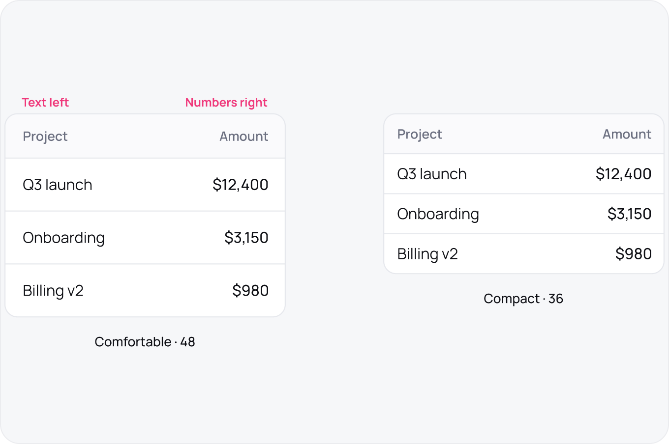
Text left, numbers right, everything else left. Offer comfortable at 48 and compact at 36 and let the user switch. Density is a user setting, not a design decision.
Column Types
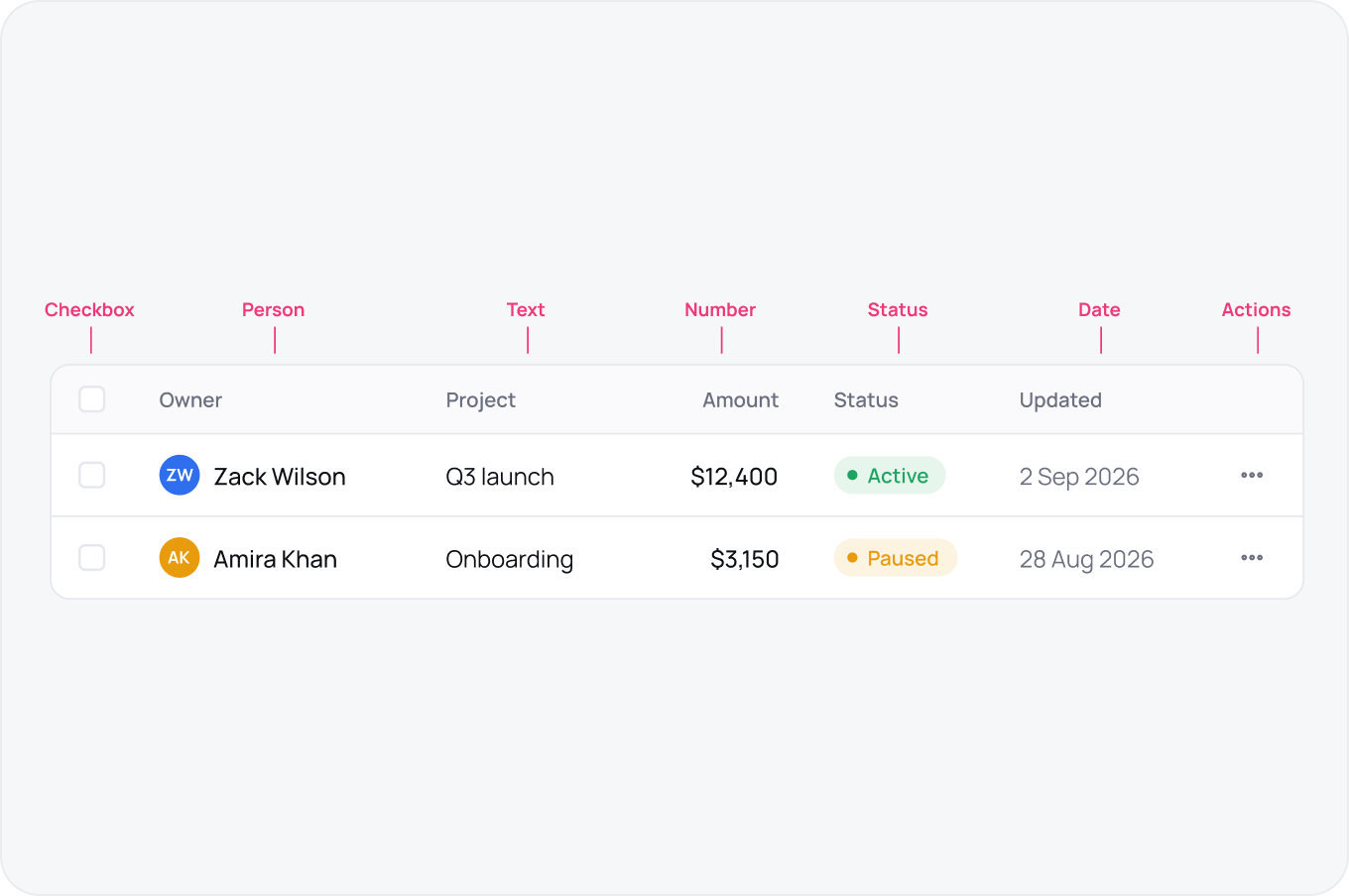
Most tables need seven cell types: checkbox, person, text, number, status, date and actions. Design each once and every table in the product inherits them.
Sorting and Filtering
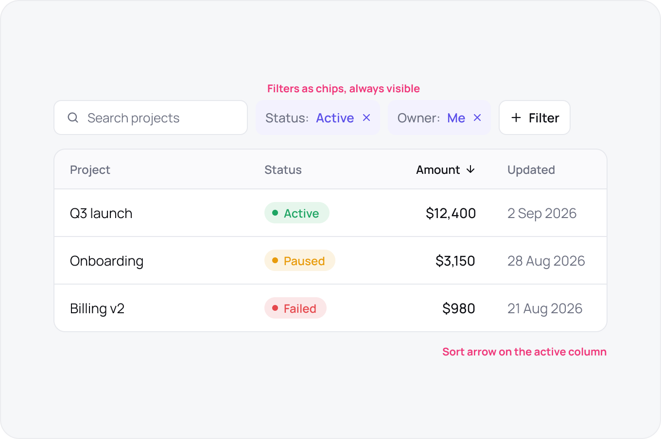
Sort lives in the header with a visible arrow on the active column. Filters live above the table as removable chips so the user always sees why the data looks the way it does.
Selection and Bulk Actions
Checkbox in the first column, header checkbox for all on page, and a bar that appears with the count and the actions. The bar replaces the toolbar, it does not stack on it.

Pagination
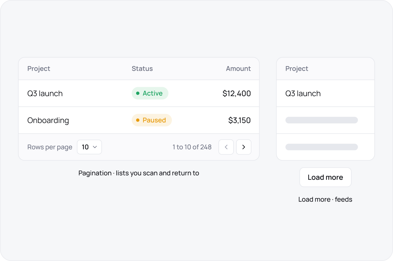
Pagination for anything the user will scan or return to, load more for feeds. Show the range and total, and keep rows per page as a choice.
Empty, Loading and Error
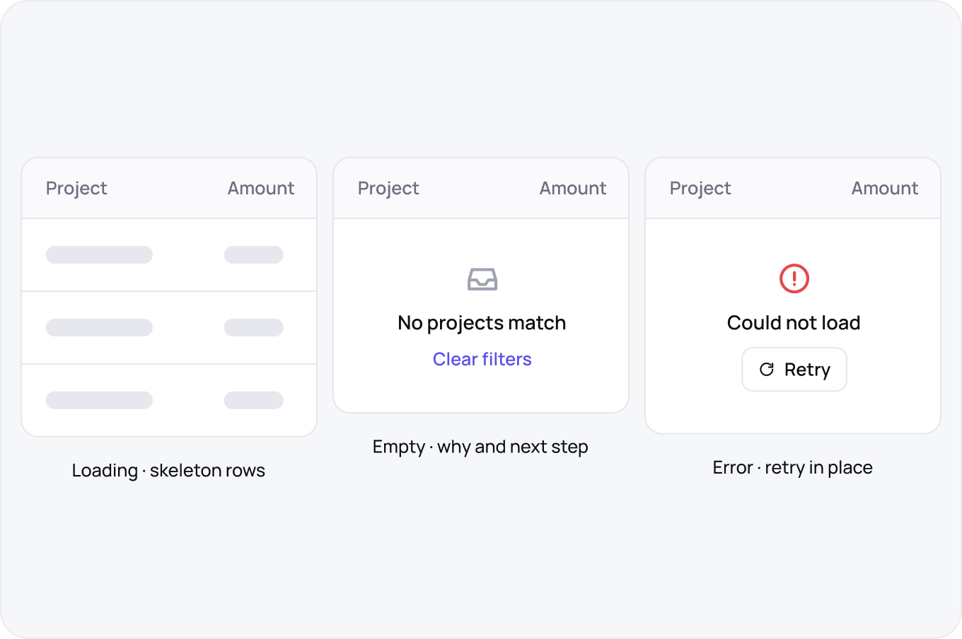
Loading shows skeleton rows in the same shape as real data. Empty says why and offers the next step. Error stays in the table and gives a retry, it does not toast and vanish.