UX/UI Design
How to Design Better Text Inputs
This practical guide teaches you how to design better text inputs by covering their core structure, states, sizes, and Figma properties. It also highlights real-world examples from design systems to help you build usable and professional forms.
Muhammad Saud Musaddiq6 min read
Structure
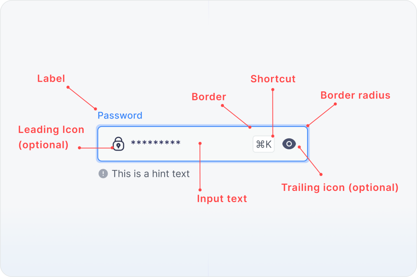
Text inputs require a highly structured and well-defined layout composed of essential elements such as clear labels, placeholder text, border radii, helper messages, and both leading and trailing icons. Carefully defining and integrating these distinct components into your UI designs is critical for establishing a strong visual hierarchy, reducing user input errors, and delivering a truly seamless and intuitive user experience.
States
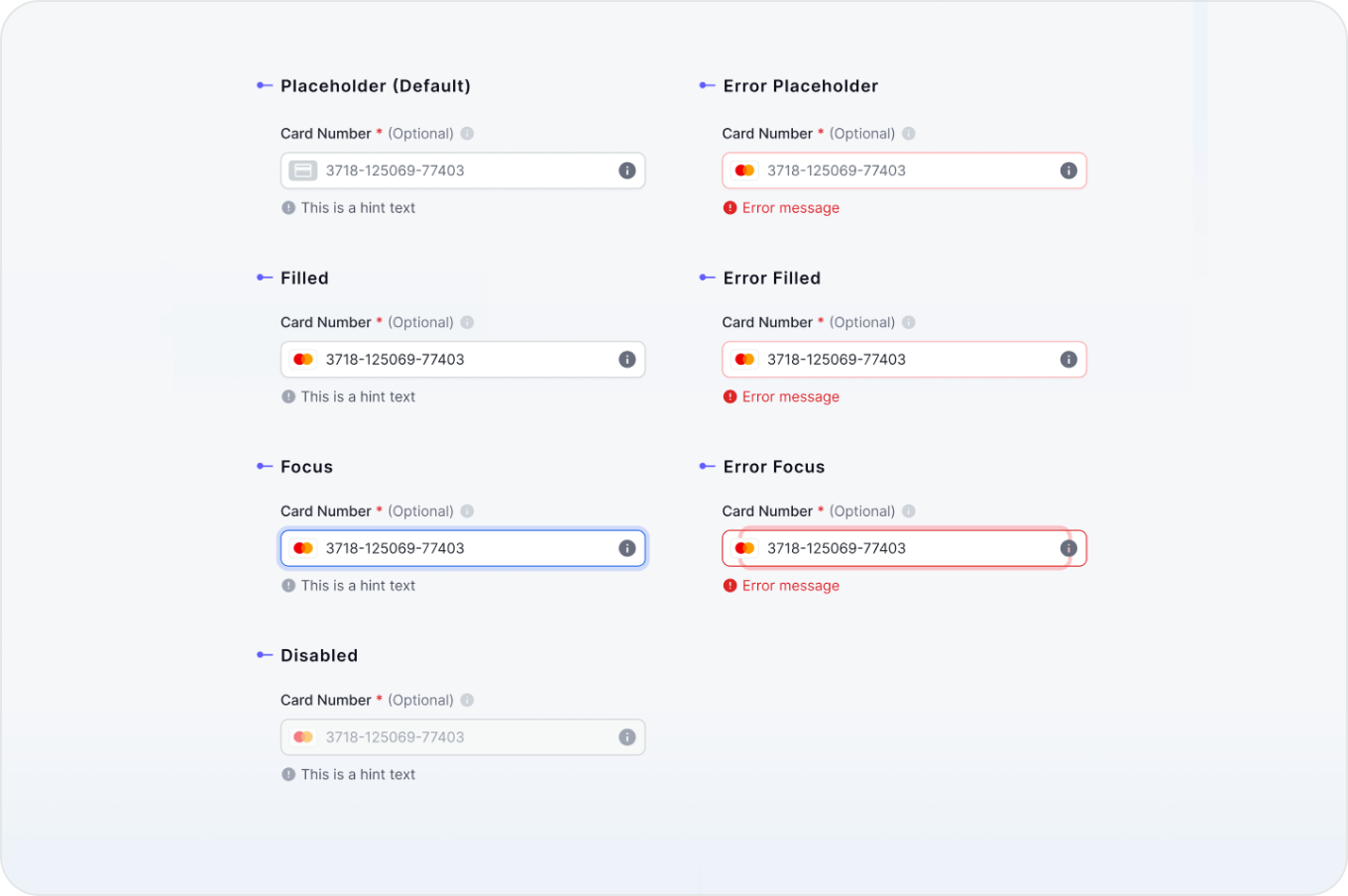
To provide intuitive interaction and clear visual feedback, you must always define and include all essential states—such as default, hover, focus, active, disabled, and error—within your design system. Documenting these variations ensures a highly predictable experience and helps users effortlessly navigate form inputs under any conditions.
Sizes
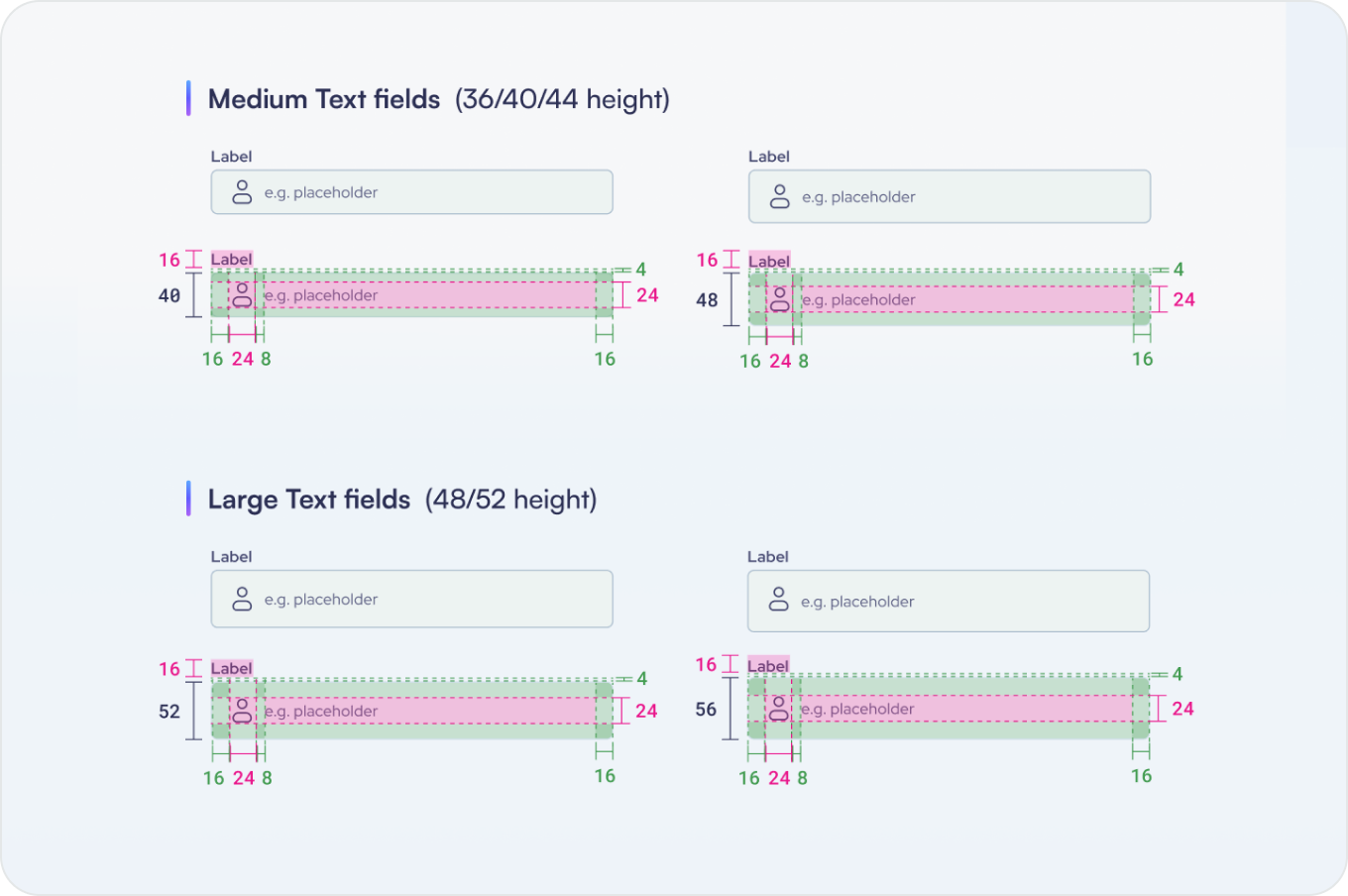
To ensure consistent and predictable interactions across different viewport sizes and devices, it is critical to define standardized dimensions, paddings, and heights for your input fields. Always document these variations within your design system to guarantee that inputs remain highly legible, easily tappable, and perfectly aligned on both mobile and desktop screens.
Properties in Figma
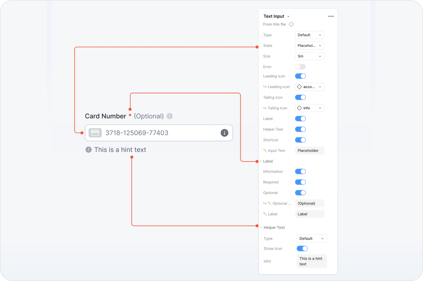
Leveraging Figma component properties allows you to build highly customizable and dynamic text inputs. By mapping variables like states, sizes, icons, and helper texts to toggleable properties, you can easily control the visibility and content of different input elements directly from the sidebar, keeping your design files clean and organized.
Famous Design Systems
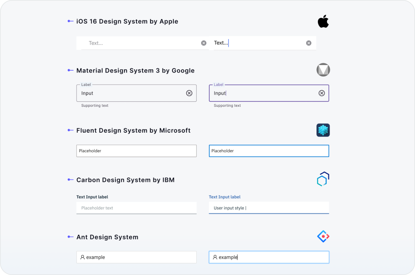
Studying how industry leaders like Apple, Google, and Microsoft structure their text inputs provides valuable insight into real-world UX patterns. Analyzing these famous design systems helps you understand established standards for states, styling, and accessibility, ensuring your own forms are both intuitive and highly functional.